01 · Landing page experimentation
Designing for different reasons to compare
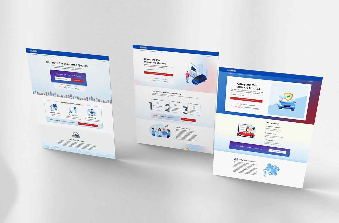
The landing page needed to work for a broad audience, but we did not yet have a clear primary user mindset. I created multiple testable directions, each built around a different reason someone might begin comparing car insurance.
02 · At a glance
A visual redesign became an audience-strategy question
The work began with a landing page and a conversion goal. The deeper challenge was deciding whose needs should shape the hierarchy. Instead of choosing one direction based on preference, I turned the uncertainty into a structured set of hypotheses the team could test.
- Role
- UX/UI Designer and Experimentation Lead
- Focus
- Audience framing, landing-page systems, responsive UX, test strategy
- Core action
- Enter a ZIP code and begin comparing quotes
- Deliverables
- Three design directions, desktop and mobile layouts, reusable components, experiment plan
- Status
- Strategy and design documented; no winning result supplied
Honest status. This case study documents the design and experimentation strategy. A validated winning variation and final conversion impact were not included in the source material, so the page does not claim either.
03 · The challenge
A page for everyone can feel specific to no one
The landing page had to welcome people with different levels of urgency, confidence, and familiarity. Without a clearly defined primary mindset, every content decision became a compromise: how much explanation to provide, where trust belonged, how prominent the form should be, and whether affordability, speed, or guidance should lead the story.
The problem was not choosing the best-looking layout. It was deciding which user motivation the layout should prioritize.
Speed versus explanation
A faster path can reduce friction, but it may leave cautious visitors without enough context.
Trust versus density
More evidence can increase confidence, but too much content can make a simple task feel complicated.
Consistency versus relevance
A shared system improves coherence, but each hypothesis needs a meaningful difference to be worth testing.
Desktop richness versus mobile focus
Large-screen storytelling must become a clear mobile sequence, not a compressed poster.
04 · The reframe
I turned an undefined audience into testable design hypotheses
01 · Observe
The existing requirement focused on the page and its conversion goal, but it did not provide one clearly prioritized user motivation.
02 · Separate the motivations
I identified distinct reasons someone might hesitate or continue: urgency, need for guidance, and need for reassurance.
03 · Design the contrast
I created variants that changed message hierarchy, imagery, trust placement, process explanation, and CTA context while preserving the same core quote-comparison action.
How might we learn which type of reassurance helps the right visitor take the next step?
05 · Audience hypotheses
Three motivations shaped three directions
How might we make one comparison experience feel more relevant to people arriving with different motivations, without fragmenting the product into unrelated pages?
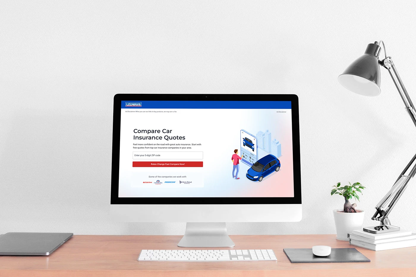
Hypothesis A: The decisive comparer
Likely question: “Can I compare quotes without wasting time?”
Primary need
Start quickly and understand the immediate action.
Page emphasis
ZIP-code action centered in the first viewport, concise messaging, a direct CTA, reduced competing content, and recognizable provider names near the action.
Expected benefit
A more compact path to the first interaction for visitors who arrive ready to act.
Risk to test
A highly direct page may feel efficient but provide too little explanation or reassurance.

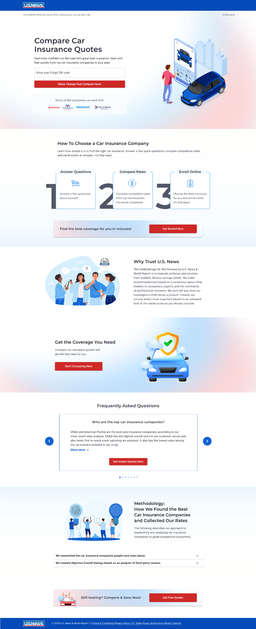
Hypothesis B: The guided planner
Likely question: “What happens after I enter my information?”
Primary need
Understand the process before beginning.
Page emphasis
The journey explained as three simple steps, a clear educational hierarchy, methodology and trust information placed where they support decisions, and CTAs repeated after explanation.
Expected benefit
Structured illustration makes the process feel manageable before the first request.
Risk to test
Additional explanation may increase confidence but delay the first conversion action.
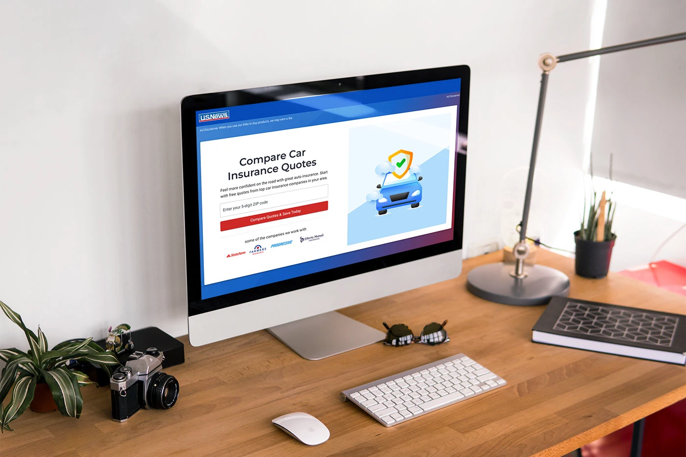
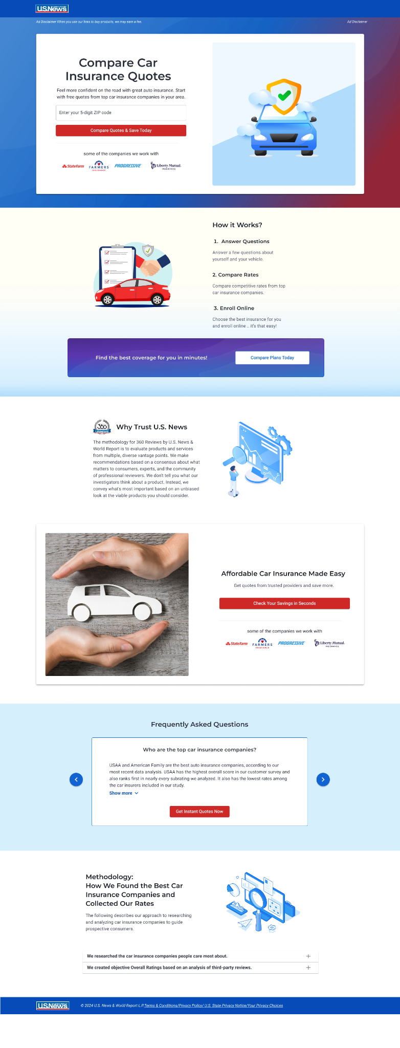
Hypothesis C: The reassurance seeker
Likely question: “Can I trust this experience, and will it help me find affordable coverage?”
Primary need
Feel protected, confident, and comfortable with the value exchange.
Page emphasis
Protection, recognizable brands, methodology, and value; imagery connected to safety and coverage; each CTA paired with reassurance or benefit language.
Expected benefit
Affordability feels concrete and the source feels credible, without promising a result.
Risk to test
Too many trust messages can create visual density or unintentionally increase concern.
These were working hypotheses for experimentation, not demographic personas or validated audience segments.
06 · One system
The variants changed the story, not the product promise
To make the comparison useful, I kept the central task and important credibility elements recognizable across directions. The variants changed what people saw first, how the process was explained, and which reassurance supported the CTA.
Held constant
- ZIP-code entry as the first task.
- Quote-comparison value proposition.
- Core provider context.
- U.S. News identity and required disclosures.
- FAQ and methodology access.
- Responsive accessibility expectations.
Changed intentionally
- Hero composition.
- CTA framing.
- Amount and timing of explanation.
- Illustration and photography strategy.
- Trust placement.
- Repetition of conversion opportunities.
- Page density and pacing.
07 · Direction A
Direct comparison: make the next action unmistakable
This direction prioritizes the visitor who arrives ready to act. The ZIP-code module becomes the visual center of the first viewport, supporting copy stays concise, and provider context sits close to the action. The design reduces interpretation before the first click.
What this direction tests
- Whether a dominant form increases starts.
- Whether concise content reduces hesitation.
- Whether immediate provider context creates enough reassurance.
Trade-off. The page is efficient, but visitors who need more explanation may not receive enough context before the first request.
08 · Direction B
Guided confidence: explain the journey before asking for commitment
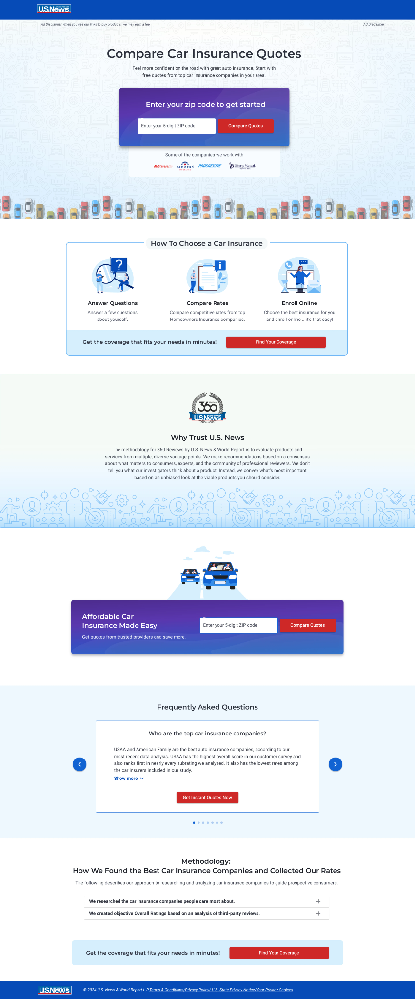
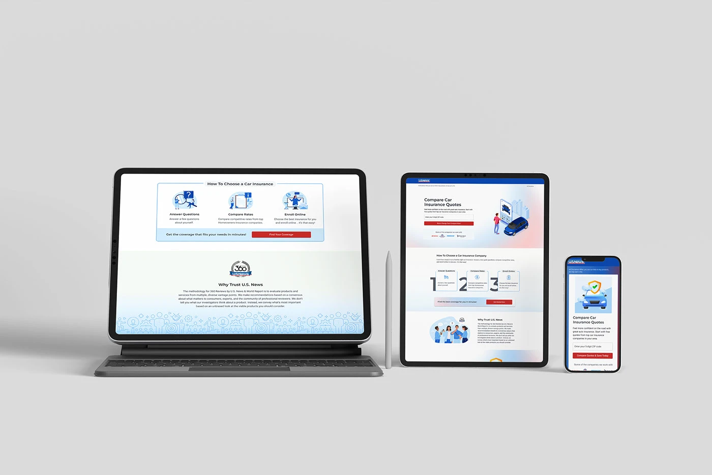
This direction supports visitors who want to understand the process. A split hero introduces the task, a three-step explanation makes the journey concrete, and methodology content reinforces why the comparison source can be trusted. Repeated CTAs appear after meaningful moments of explanation.
What this direction tests
- Whether process clarity improves form starts.
- Whether education supports completion instead of distracting from it.
- Whether repeated CTAs work better when they follow relevant context.
Trade-off. The added explanation may build confidence, but it also increases page length and creates more opportunities to postpone action.
09 · Direction C
Protection and value: connect comparison with reassurance
This direction emphasizes the emotional and practical reason to compare: feeling protected while finding coverage that fits. Safety imagery, affordability language, brand context, and methodology content work together to make the value exchange feel more concrete.
What this direction tests
- Whether protection-focused imagery increases confidence.
- Whether value language makes the comparison task feel more relevant.
- Whether trust evidence placed throughout the page supports progression.
Trade-off. More reassurance can strengthen credibility, but too many trust cues may add density or make visitors wonder why so much reassurance is necessary.
10 · Responsive thinking
Mobile required a new reading order, not a smaller layout
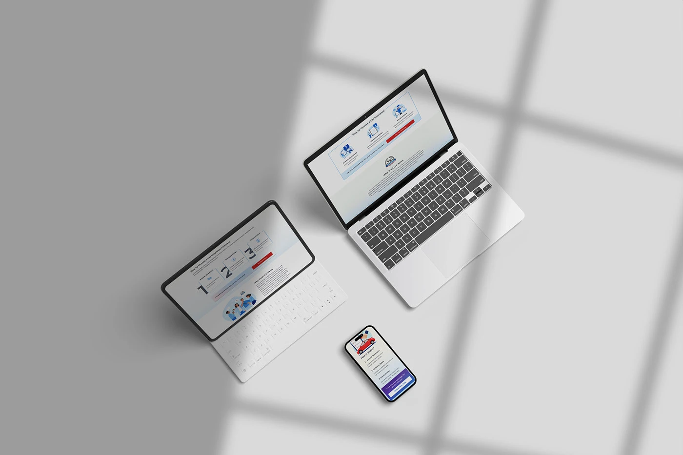
On desktop, the page can use side-by-side explanation, large illustration, and visual comparison. On mobile, the sequence must protect the core task, move reassurance closer to the decision it supports, and avoid making people scroll through decoration before reaching an action.
- Keep the ZIP field and primary CTA in the first meaningful viewport.
- Stack hero content in the order needed for comprehension.
- Reduce decorative image area without hiding essential evidence.
- Keep buttons at least 44px high.
- Use progressive disclosure for FAQ and methodology details.
- Repeat CTAs only after a meaningful block of content.
- Preserve consistent labels and action language.
- Prevent long headings and provider marks from becoming unreadable.
11 · Experiment plan
Design the comparison so the result teaches us something
Testing three pages with too many unrelated changes can produce a winner without explaining why. I would sequence the work so the team first learns which message and hierarchy matter, then isolates the components responsible for the change.
Phase 1
Message and hierarchy test
Compare the three coherent directions to identify which motivation produces the strongest quality signal.
Phase 2
Component isolation
Test the most influential elements separately: CTA framing, process explanation, trust placement, hero imagery, or form prominence.
Phase 3
Segment and context review
Examine whether performance differs by device, acquisition source, returning versus new visitor, or other available non-sensitive context.
Primary metric
Qualified quote-flow starts, defined consistently across variants.
Secondary metrics
- CTA interaction rate.
- ZIP-field completion.
- Progression into the quote flow.
- Downstream completion where measurement is available.
Guardrails
- Error rate.
- Form abandonment.
- Performance and load time.
- Mobile usability.
- Accessibility issues.
- Misleading or overly promotional interpretation.
No winning variant or measured conversion lift was supplied for this case study. This section documents how I would structure the experiment and interpret its evidence responsibly.
12 · How I would read the result
A higher click rate would not be the only signal
More starts, stable completion
A promising direction worth isolating and validating.
More starts, lower completion
The page may be creating curiosity without setting accurate expectations.
Fewer starts, stronger completion
The page may be filtering for higher intent; evaluate business value and traffic context.
No clear difference
Simplify the hypothesis, improve measurement, or test one high-impact component at a time.
13 · Craft and trade-offs
What I would refine before the next round
- Reduce variation in CTA wording so message effects are easier to isolate.
- Standardize repeated trust modules across directions.
- Review whether some illustrations clarify the process or merely decorate it.
- Audit contrast and type size inside source designs, especially on mobile.
- Simplify long mobile pages through progressive disclosure.
- Confirm that provider marks remain legible without dominating the task.
- Separate personalization hypotheses from purely aesthetic differences.
- Validate that affordability language does not imply guaranteed savings.
14 · Reflection
The strongest outcome was a clearer question to test
The question before
“Which landing page looks best?”
The question after
“Which type of reassurance helps the right visitor move forward?”
That shift made the design work more useful. It connected visual decisions to audience motivation, made trade-offs explicit, and created a path for learning instead of relying on preference.
What I took from it
- 01
Personalization begins with a meaningful hypothesis.
A different illustration is not personalization unless it supports a distinct user need.
- 02
A variant should be coherent.
Message, hierarchy, imagery, and CTA context should reinforce the same motivation.
- 03
Consistency makes comparison easier.
Shared components reduce noise and make the important differences more visible.
- 04
Conversion quality matters.
More clicks do not help if people enter the flow with the wrong expectation.
- 05
Absence of a defined audience is itself a design finding.
It should be turned into a research and experimentation plan, not hidden behind visual polish.
15 · The takeaway
I designed three directions to answer one strategic question
By connecting audience motivations to message hierarchy, visual emphasis, responsive behavior, and measurement, I turned an unclear landing-page audience into a structured experiment the team could learn from.
3
Mindset hypotheses
1
Shared conversion task
Role
UX/UI Designer and Experimentation Lead
Focus
Audience hypotheses · Conversion design · Responsive systems · A/B-test planning