Redesigning the Insurance hub around what users actually click
How heatmap evidence, a conversion-first hero, and an SEO preservation audit turned a 9,500-pixel link list into a quote-comparison experience, without losing a single production link.
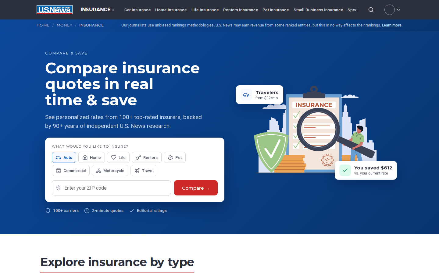
The redesigned hub: quote-form hero, eight coverage types, trust signals in the first viewport.
The project in 90 seconds
The old insurance page could only be read. This redesign gives it a job to do.
- Route people to their insurance type
- Feed the quote forms that make money
- Keep every bit of SEO value intact
This case study walks through how we got there: the heatmap study that found the real problem, the ten decisions that followed, and the audit that protected the site's search rankings.
The problem
- A uniform 9,500px list of eight insurance verticals
- No form, no hierarchy
- Trust content buried at the bottom
- Structurally unable to generate a single form start
The evidence
- 15 days of Crazy Egg data
- ~40% of clicks chase car insurance
- "Cheapest" links dominate
- 26.6% of mobile clicks land on things that aren't links
The redesign
- Quote-form hero defaulting to Auto
- All eight categories in one explorer grid
- Awards with transparent scoring
- Three layers of trust signals
The safeguard
- Restored ~120 production links
- Matched the title tag
- Added six JSON-LD schema types
- Audit score 66 → 88
The problem: a page that could only be read, never used
"As a user looking for insurance, I would like to navigate to the specific type of insurance I need so that I can take some kind of action."
Goals: increase form starts into monetized quote forms; increase pageviews to key rankings and guide pages. Acceptance criteria included monetized entry points, a calculators section, trust signals, preservation of all existing links, and delivery across mobile, tablet, and desktop.

The original sectionfront: eight near-identical stacked sections, a survey grid, and "Why Should You Trust Us?" at the very bottom.
No path to action
366 desktop clicks in 15 days and not one could start a quote. The page's only verbs were "read."
Every vertical treated equally
Car, Home, Life, Renters, Pet, Business, Specialty and Travel got identical real estate, while the click data shows one of them owns ~40% of intent.
Trust as an afterthought
The authority story, 90+ years of journalism, unbiased methodology, sat below the 9,000px mark, past where scrollmaps go cold.
What 695 visits taught us
Crazy Egg snapshots of the live page · 15 days ending Aug 3, 2026 · 435 desktop + 260 mobile visits · full report: crazye.gg/feada5d35887d620
"Car Insurance" pill, car links and the car photo top every click list.
Taps on headers, chrome and a disclaimer that goes nowhere.
Repeated frustrated taps, concentrated on non-interactive text.
Against a ~9,500px page, six of eight categories rendered near-invisible.
36 taps on the methodology disclaimer. All of them dead.
Nearly half of visitors left without a single click.
Desktop clicks concentrate on the Car Insurance pill and "Cheapest…" links.
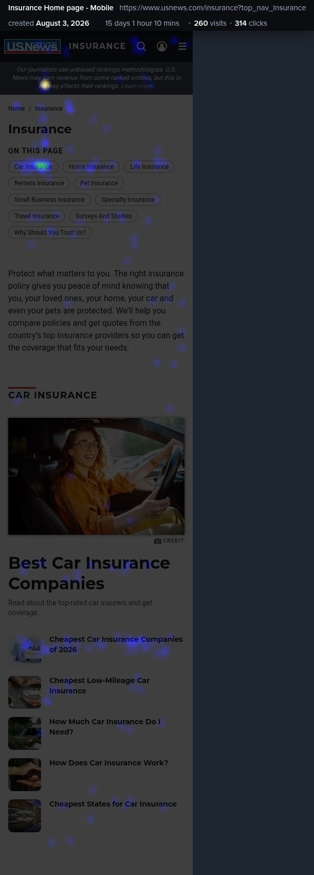
Mobile: the hottest element above the fold is a disclaimer that isn't tappable.
Car dominates intent
Auto deserves default-selected status, not an equal slot in an eight-item list.
"Cheapest" is the verb
Users are price-shopping, validating a compare-quotes form as the primary action.
Users click things that aren't links
The old page taught users that big text means navigation, then punished them for believing it.
The fold is shallow, the page is deep
Whatever matters must live in the first two viewports.
Zero conversion surface
The #1 KPI (form starts) was structurally impossible on the old design.
Ten decisions, each with a receipt
Every major choice traces to a heatmap insight, an acceptance criterion, or an explicit trade-off. The six most consequential:
Lead with a quote form, not an index
Replace the editorial H1 and intro with a conversion hero: coverage chips, ZIP field, red "Compare →" button.
KPI #1 is form starts; the old page had zero form surface; "Cheapest…" links dominated clicks.
Risks reading as an aggregator, countered with an editorial trust row directly under the form.
Default to Auto, make ZIP conditional
"Auto" is pre-selected; only Auto, Home, Renters and Pet show a ZIP field, the rest go straight to a quote CTA.
~40% of clicks are car-related; ZIP is only collected where the monetized flow needs it.
Slightly biases the UI toward one vertical, accepted, because the data does too.
Compress 9,500px into one explorer grid
All eight categories become one card grid with the same 48 sub-links the old page had.
938px average fold meant six categories were effectively invisible; acceptance criteria required keeping every link.
Loses the large category photos, imagery moved to guides, where it earns engagement.
Make everything clickable actually clickable
Whole-title link targets, hover states on every card, real hrefs on all ~120 links.
Dead clicks: 10.4% desktop, 26.6% mobile, users repeatedly clicked non-link headers.
None. This one was free.
Move trust next to the ask
Three trust layers: hero trust row, mid-page stats band (1933 · 100+ · $0 · 85K+), and an awards showcase with a transparent "How we scored" weighting panel.
Acceptance criterion #5; the old trust block sat below the 9,000px mark, past where scrollmaps go cold.
Spends premium viewport space on non-clickable content, justified as conversion support.
Treat SEO as a constraint, not a retrofit
A dedicated audit pass after visual design: restore every production link category, match the title tag, add canonical, Open Graph and six JSON-LD types.
The first design draft scored 41/100, a great UX shell with hollow SEO. The ticket demands preservation.
A full extra workstream, and the reason the final scored 88/100 against production's 66.
Also decided
- Keep the editorial disclaimer but give its "Learn more" link a real destination (it was mobile's #1 dead tap)
- Label the rate comparison "SAMPLE" rather than fake personal quotes
- Defer a dedicated calculator module to the roadmap pending product inventory, shown here as an open item, not quietly dropped
The redesign, section by section
Each module answers a specific finding. Screenshots are from the final high-fidelity prototype, built on U.S. News design tokens.
The hero: chips, conditional ZIP, and a trust row in one card.
A quote form as the front door
- "Compare insurance quotes in real time & save": eight coverage chips plus a ZIP field and a red Compare button
- Auto is pre-selected
- Life, Commercial, Motorcycle and Travel skip the ZIP entirely, no field is asked for that the flow doesn't need
- Validation, loading and success states are fully specified, down to the aria-live announcements
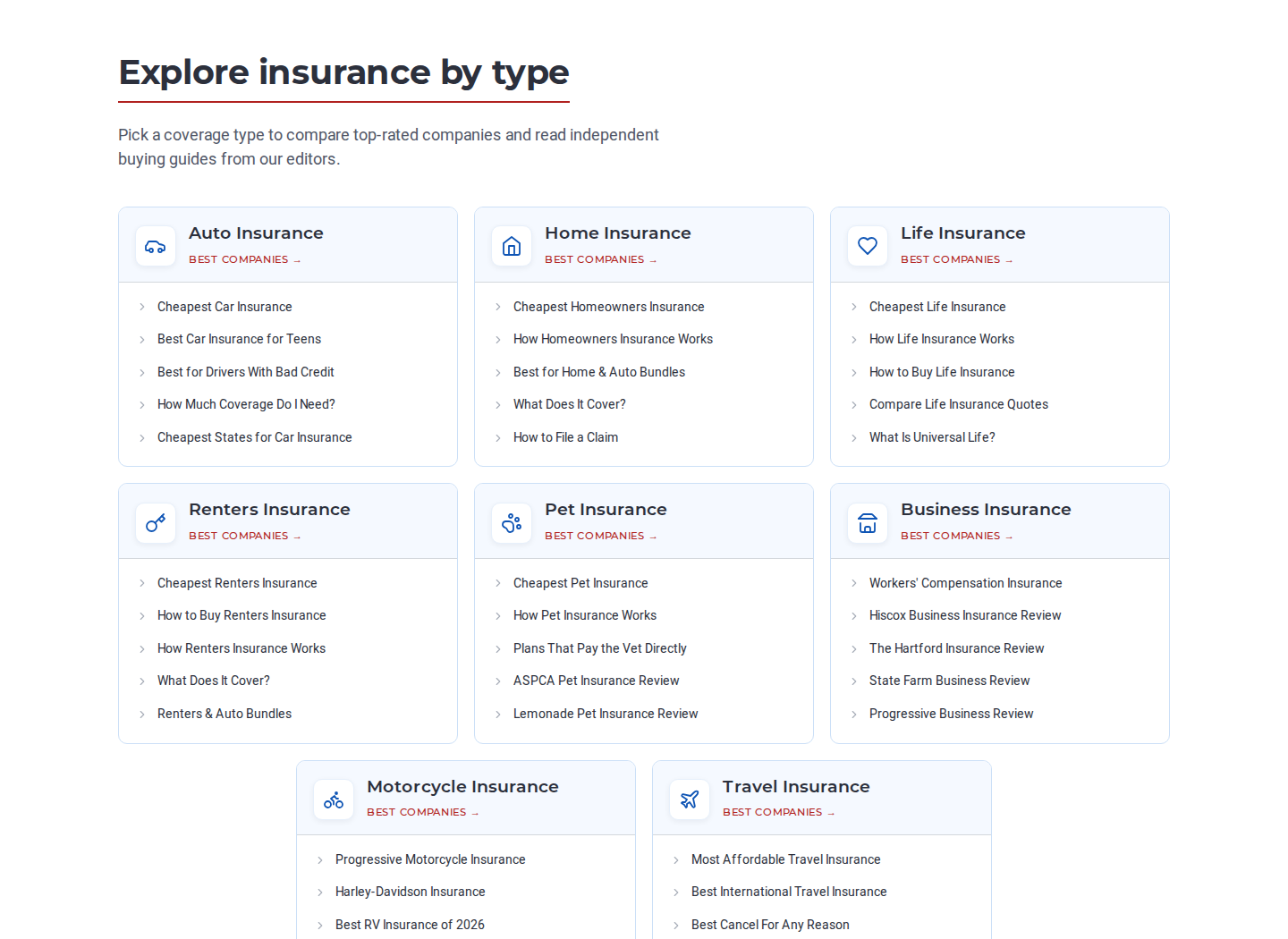
Eight categories, 48 preserved sub-links, one viewport.
Explore insurance by type
- Eight stacked sections become one grid
- Every card is a full click target, with an icon and a "Best Companies" ranking link
- The same five sub-links users already relied on, "Cheapest…" first, because that's what they click
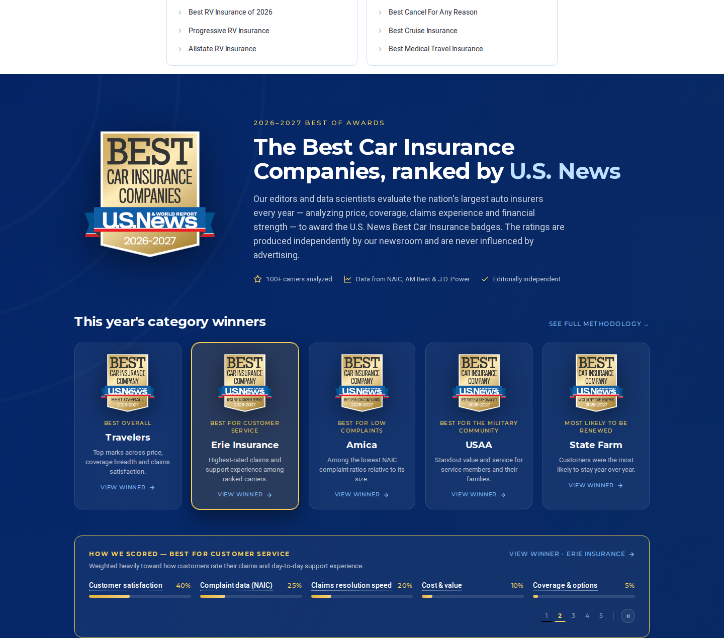
Award winners with their scoring weights exposed.
Awards with the math showing
- The Best Of Awards band doesn't just display badges, it auto-plays through the category winners so visitors see the full lineup without clicking
- Each slide auto-reveals a "How we scored" breakdown for that winner: Customer satisfaction 40%, Complaint data (NAIC) 25%, Claims resolution speed 20%, Cost & value 10%, Coverage & options 5%
- Methodology transparency becomes a feature no aggregator can copy
- These badges are a real revenue line, carriers license the winning seal for their own marketing, so a clear, defensible scoring story protects that business
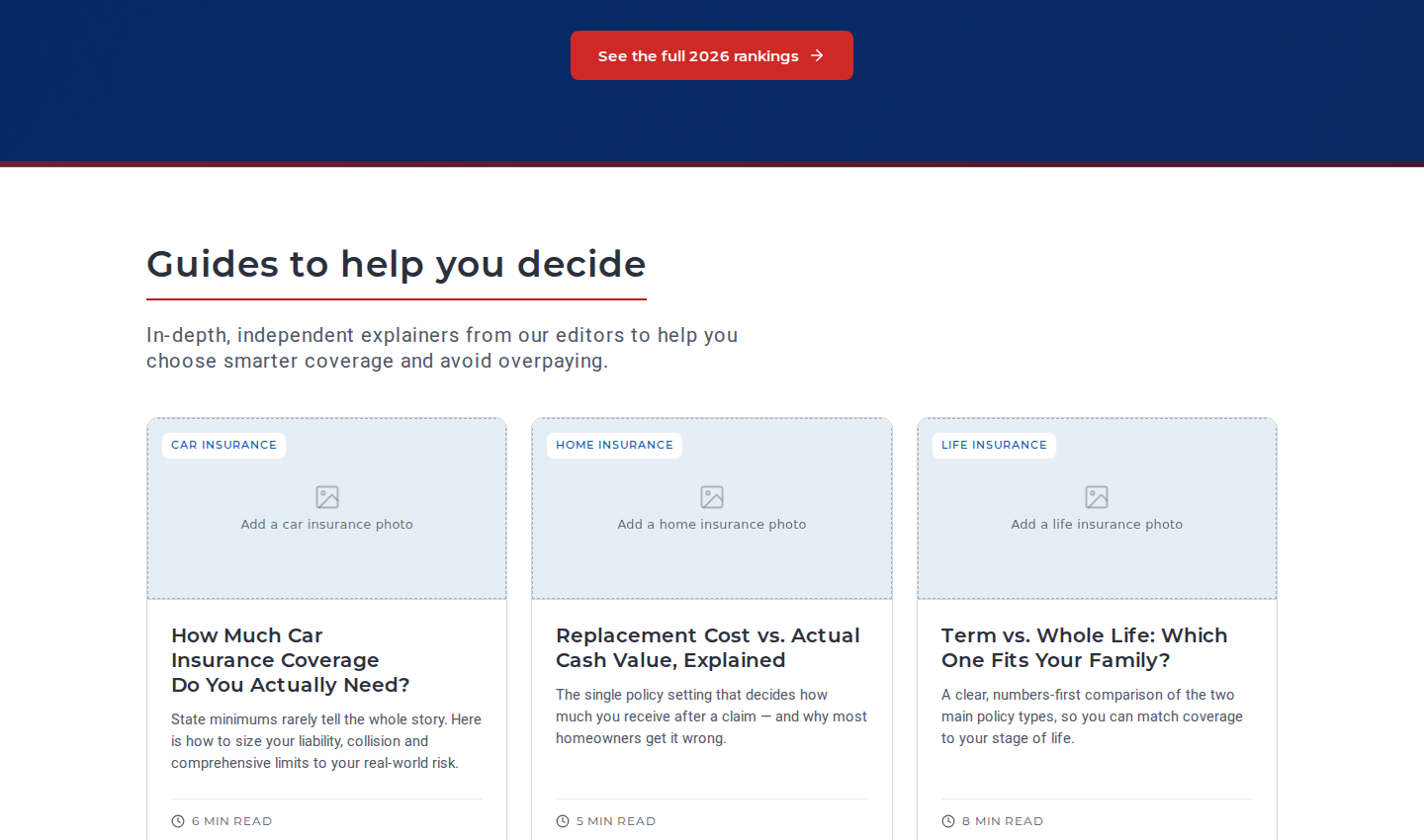
Guides: three visible, expandable to six, whole-title links.
Editorial guides and savings tips
- The pageview KPI survives the redesign
- Guide cards with real linked titles
- A "Ways to lower your premium" tips row routes into bundle and discount pages
- Mid-funnel content that also feeds topical authority
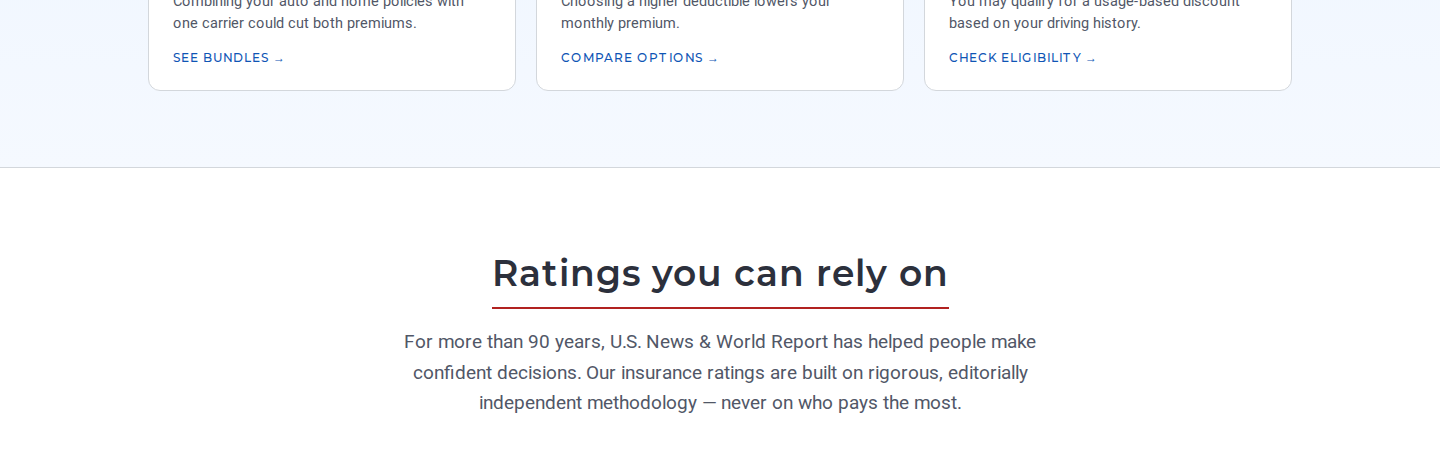
1933 · 100+ · $0 · 85K+, authority in four numbers.
Ratings you can rely on
- The trust story moves from the page's basement to its midpoint
- Founded 1933, 100+ carriers rated, $0 cost to consumers, 85K+ data points
- Placed immediately before the second conversion ask
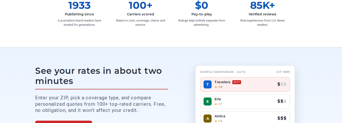
An honest sample comparison beside the CTA.
See your rates in about two minutes
- Shows the shape of the payoff before asking for anything
- A comparison card explicitly labeled "SAMPLE COMPARISON · AUTO / ZIP 10001"
- An honest preview reduces the perceived risk of starting the form
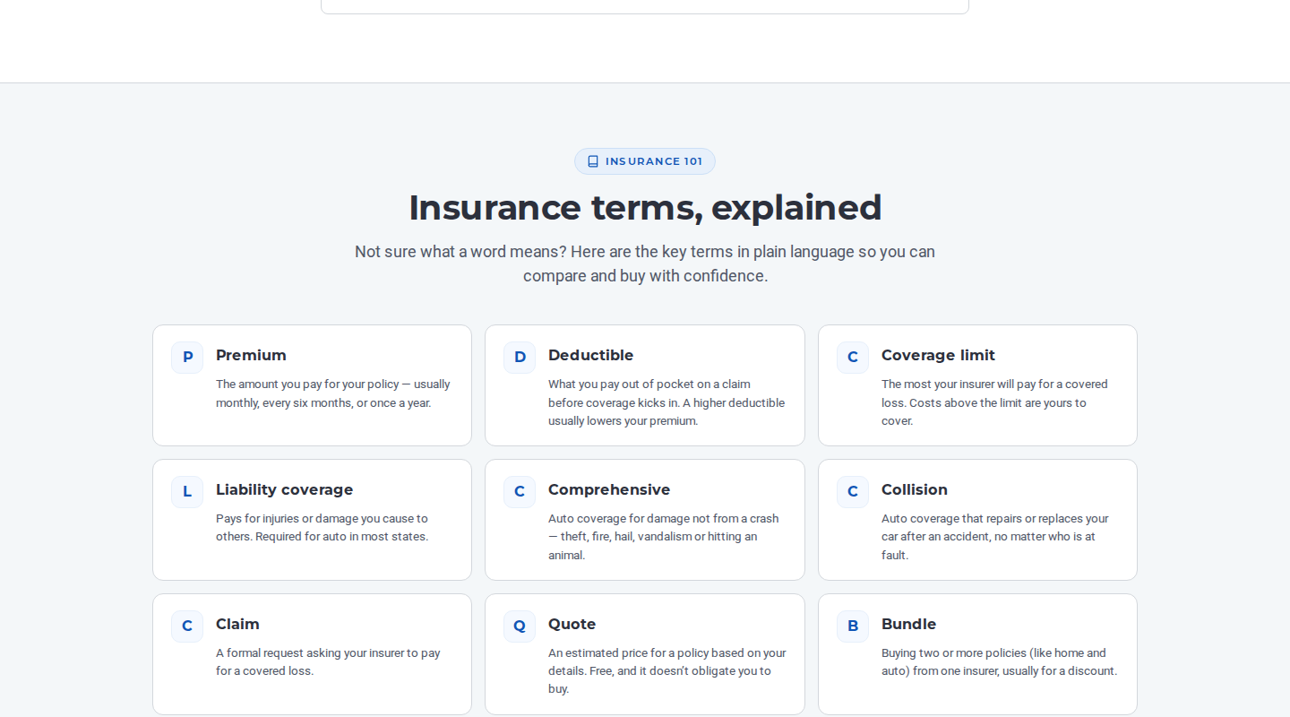
Insurance 101: ten terms, passage-rankable.
FAQ and a glossary the old page never had
- Five FAQs with FAQPage schema
- A ten-term glossary gives first-time buyers a vocabulary
- Gives AI search engines citable passages
- Net-new topical authority production lacked
Keeping the equity: 66 → 88
The ticket's hardest constraint: "maintaining all of the SEO elements the current page already has." The first design draft failed it. The audit fixed it.
Composite audit across UX, internal linking, schema, E-E-A-T, AI-search readiness and Core Web Vitals signals.
~120 dead href="#" links replaced with real usnews.com URLs, nav, breadcrumb, 8 category cards with 48 sub-links, guides, awards, and the full ~50-link footer taxonomy.
Missing metadata added: production-matching title tag, meta description, canonical, robots directives, Open Graph and Twitter cards.
Six JSON-LD types added, more than production has: Organization, WebSite + SearchAction, WebPage, BreadcrumbList, FAQPage, ItemList.
Methodology links made real, award winners entity-linked to their carrier review pages, descriptive anchor text everywhere.
Deliberately omitted: Review/AggregateRating schema, it needs real CMS rating data to avoid rich-result penalties. URL slugs follow usnews.com patterns but are flagged for validation against the live sitemap before launch.
One system, three devices
No separate mobile art files, the design is fluid by construction: clamp() typography, flex-wrap, and auto-fit minmax grids, with six explicit breakpoints where grids re-column.
Desktop · 1440px
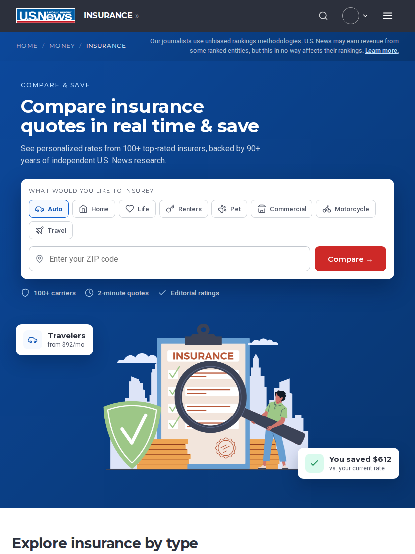
Tablet · 834px
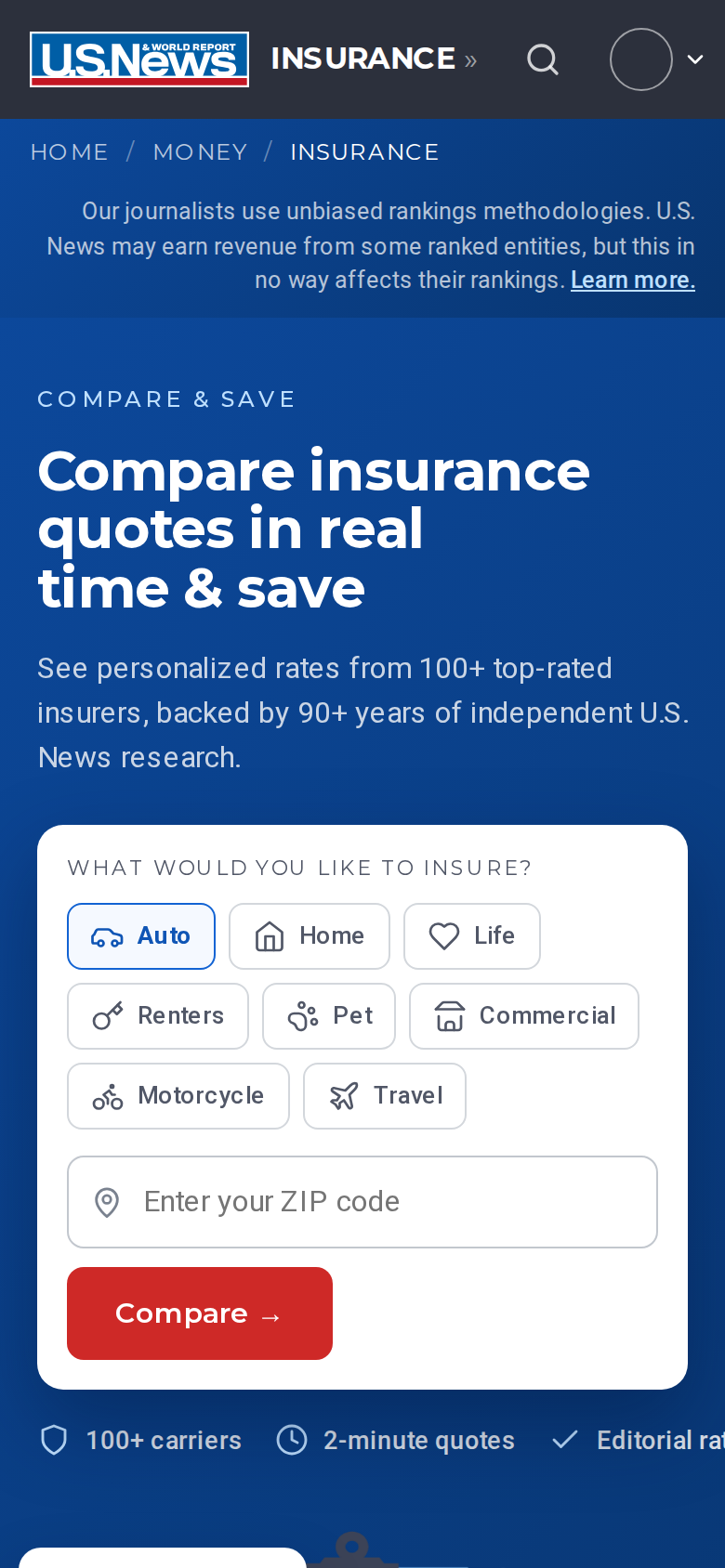
Mobile · 390px
What success looks like, honestly
This case study was written at handoff, before launch. There are no invented uplift numbers here, there is a measurement plan, with the heatmap study as its baseline.
Form starts
- From structurally zero to a measurable funnel
- Tracks hero form starts
- Completion rate and per-coverage-type mix
Pageviews to key pages
- Click-through to "Best Companies" rankings
- And to guides
- Measured against the old page's baseline
Mobile dead-click rate
- Baseline: 26.6%
- Every element that looks clickable now is
- This number should collapse
Bounce rate
- Desktop baseline: 46.7%
- If conversion rises while bounce spikes, the form is capturing instead of serving
- That trade is not acceptable
Open at handoff:
Dedicated calculators module pending product inventory (acceptance criterion #3, tracked, not dropped)
URL slug validation against the live sitemap
Server-side rendering and Core Web Vitals work (font preloads, image dimensions) at the template level
The old page could only be read. The new one can be used, and it can be measured.