Migration and quality assurance
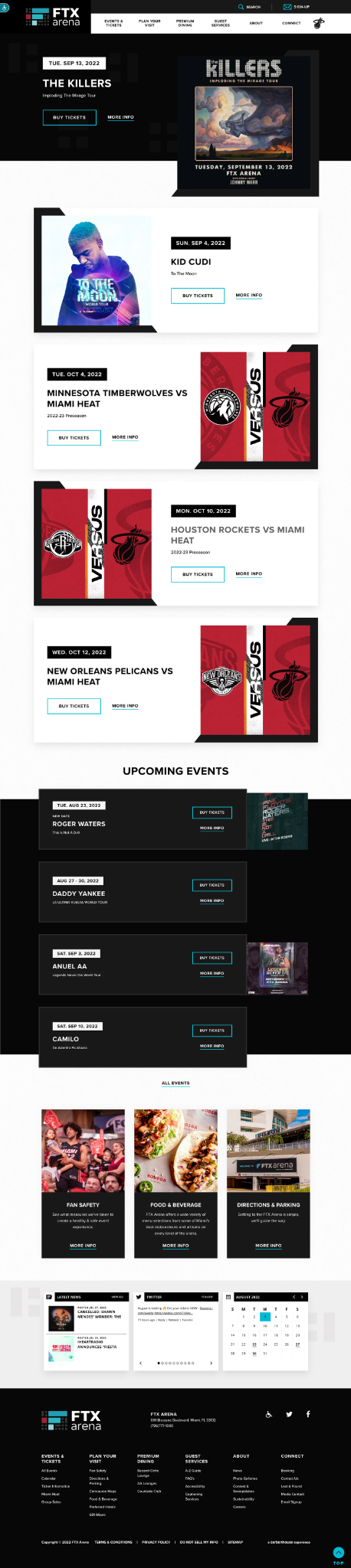
I moved and reviewed content across the new CMS, checking page structure, links, images, labels, and responsive behavior before launch.
We use cookies to understand how visitors use this site. Analytics stays off unless you accept.
01 · Arena website rebrand and CMS migration
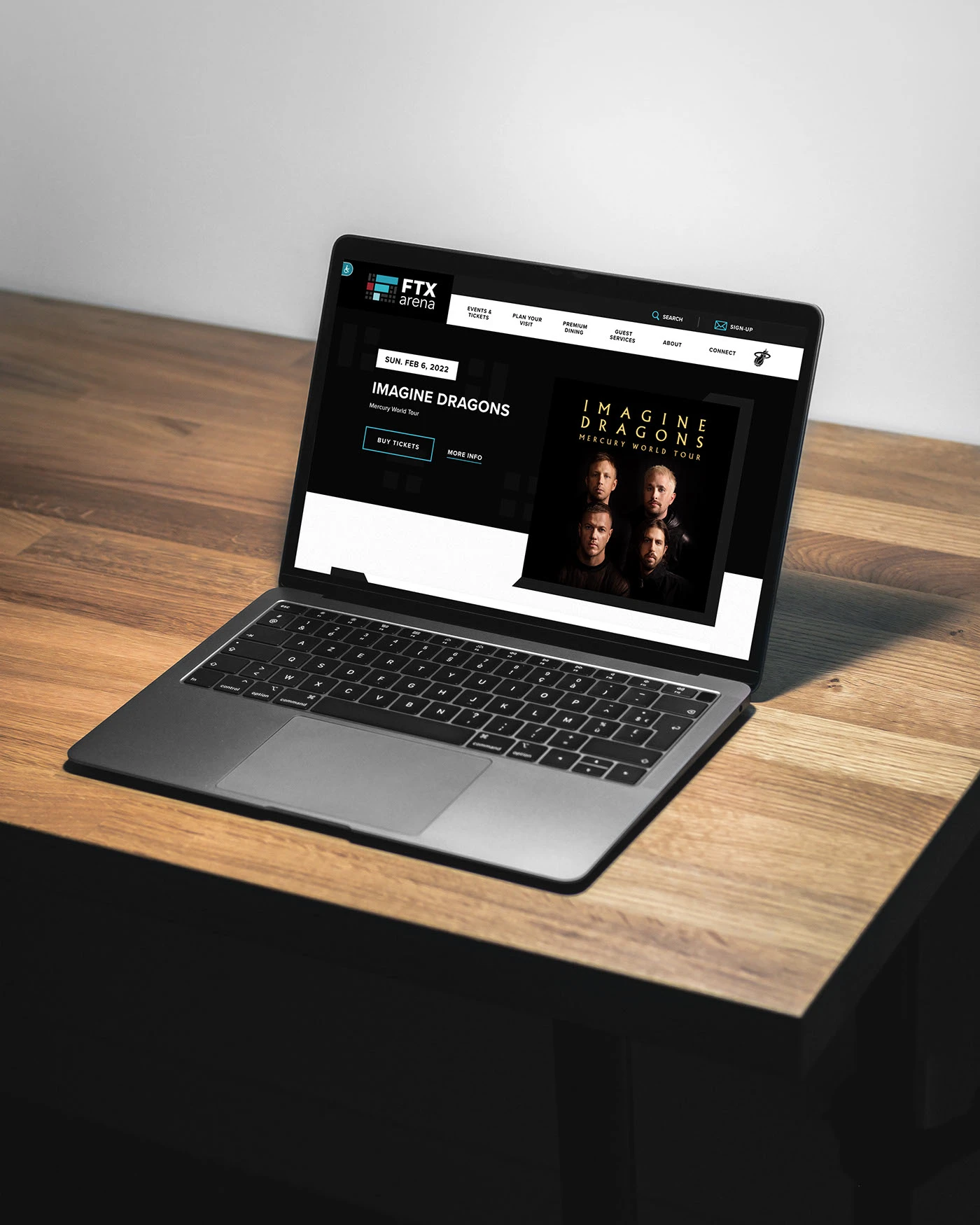
I helped move FTXArena.com to KaseyaCenter.com while events, ticket links, premium offerings, and visitor information stayed current. The work combined content migration, quality assurance, reusable CMS components, and clearer fan journeys.
02 · Project snapshot
The arena was changing its name, domain, brand, and content system. At the same time, the public website still had to support upcoming events, ticket sales, premium hospitality, food, parking, and venue planning.
My job was to help move the content safely, make high intent tasks easier to find, and give internal teams components they could update without rebuilding pages from scratch.
03 · The challenge
A live venue website behaves more like an operating service than a finished brochure. Dates move, ticket links change, event artwork arrives, premium offers evolve, and visitors need accurate answers before they travel.
The venue seats 19,600 people and hosts more than 100 events each year, so a broken link or stale event detail can affect many different fan journeys.
The goal was to complete the migration without losing the speed and accuracy that daily publishing required.
04 · My contribution
I moved and reviewed content across the new CMS, checking page structure, links, images, labels, and responsive behavior before launch.
I updated concerts and tours as information changed, then verified that every ticket action reached the right Ticketmaster destination.
I built flexible sections for Bacardi Ocho Lounge and Loge Suites so teams could update copy, photography, pricing, and calls to action without a custom rebuild.
I implemented campaign popups for season tickets and special announcements, with clear messaging and controlled placement.
05 · Experience strategy
The navigation and homepage modules were shaped around intent. A fan should not need to understand the arena's internal structure to find the next useful action.
06 · Events and ticketing
Dates, titles, artwork, and actions follow the same order so people can compare events quickly.
Buy Tickets stays consistent across the experience, reducing hesitation at the most important action.
More Info supports visitors who need event details before they are ready to purchase.
07 · Wayfinding
A complete view for people who want to browse beyond the featured list.
A direct path for visitors planning what to eat and where to meet.
Practical arrival information that reduces uncertainty before the event.
08 · Reusable CMS components
Bacardi Ocho Lounge and Loge Suites needed polished presentation, but they also needed to stay easy to maintain. Reusable components created a dependable structure while leaving room for new copy, pricing, and imagery.
Premium page component
Field 01 · Headline and description
Bacardi Ocho Lounge
One short paragraph of editable positioning copy.
Field 02 · Photography
Gallery slot filled by the editor.
Field 03 · Pricing or package details
Editable rows for inclusions, capacity, and price or inquiry details.
Field 04 · Primary call to action
Request informationSame component, lounge content. Copy, gallery, and price details change without touching the layout.
Same component, suite content. Availability and package details stay current because they live in fields, not in a one off page build.
The point of the structure was practical. When a premium package changed, the team edited fields instead of asking for a new page.
09 · Campaign support
Promotional components gave the team a faster way to support season tickets and special announcements. The pattern kept the message focused, the action clear, and the rest of the page available when the visitor was not interested.
10 · Process
Every item was reviewed in context, not in isolation.
11 · Mobile behavior
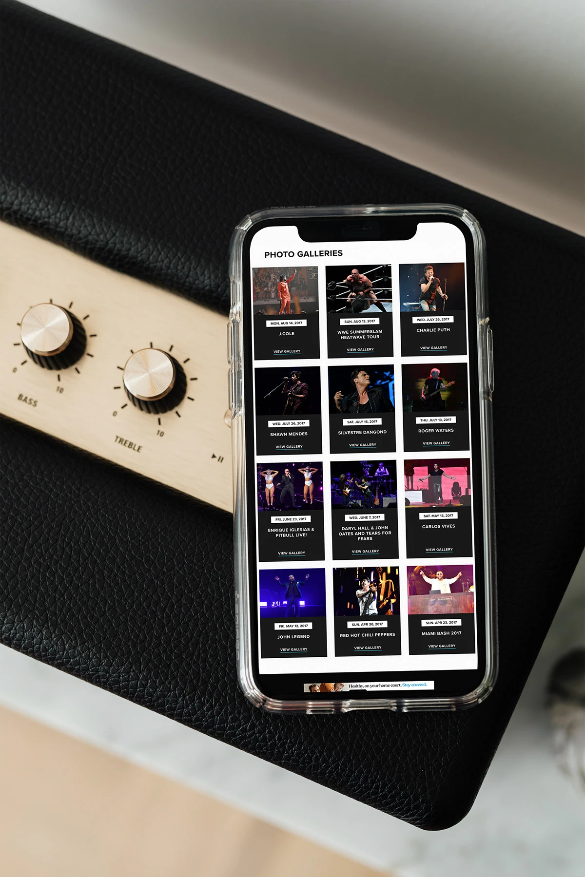
On mobile, the priority is clarity. Event artwork, dates, titles, and actions need enough space to remain readable without turning the page into a wall of small cards.
12 · Outcome
The team could make rapid content changes during the rebrand with minimal downtime.
Events, tickets, planning information, and premium offerings gained a clearer information scent.
Reusable CMS components reduced one off page work and gave teams a dependable structure for future changes.
Link, content, image, and responsive reviews helped reduce the risk of stale or mismatched information.
13 · What I learned
This project reinforced that a redesign is not finished when the interface looks right. For a venue, the experience depends on what happens after launch: how quickly an event can be updated, how confidently a link can be verified, and how easily a visitor can find the next useful step.
The strongest design decision was creating structure for change. Clear event patterns, reusable premium modules, and a practical review process helped the website stay useful while the organization moved through a major transition.
14 · Closing
The final experience supports two groups at once: fans who need clear answers and internal teams who need to publish accurate information quickly.
Back to workSeason tickets
One message, one action, and an easy way back to whatever you came here to do.