One focused product image slot
Shop Jerseys
Connect player stories and team moments to relevant merchandise using one focused image, a short label, and a clear shop action.
Shop jerseysWe use cookies to understand how visitors use this site. Analytics stays off unless you accept.

I helped redesign the Miami HEAT homepage as a flexible publishing system for game days. The new structure put schedules and tickets first, gave marketing room for memberships and merchandise, and made live updates easier for the content team.
The homepage had to do more than introduce the brand. It was often the fastest route to a game, ticket, score, schedule, player, or jersey. At the same time, the content team needed to react to a live season without waiting for a custom page build.
I approached the redesign as a hierarchy and publishing problem. The interface needed stronger priorities for fans and a more flexible structure behind the scenes.
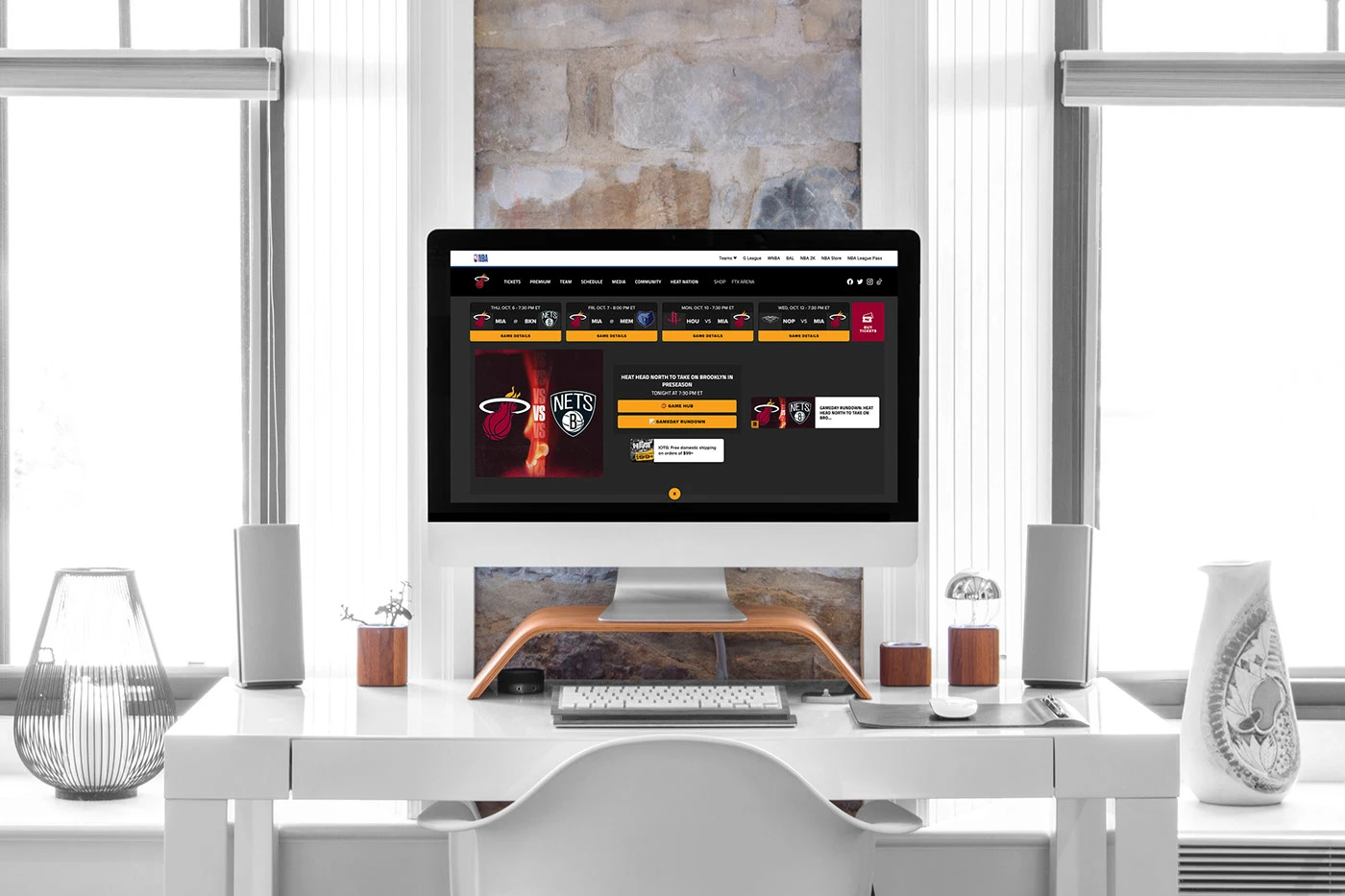
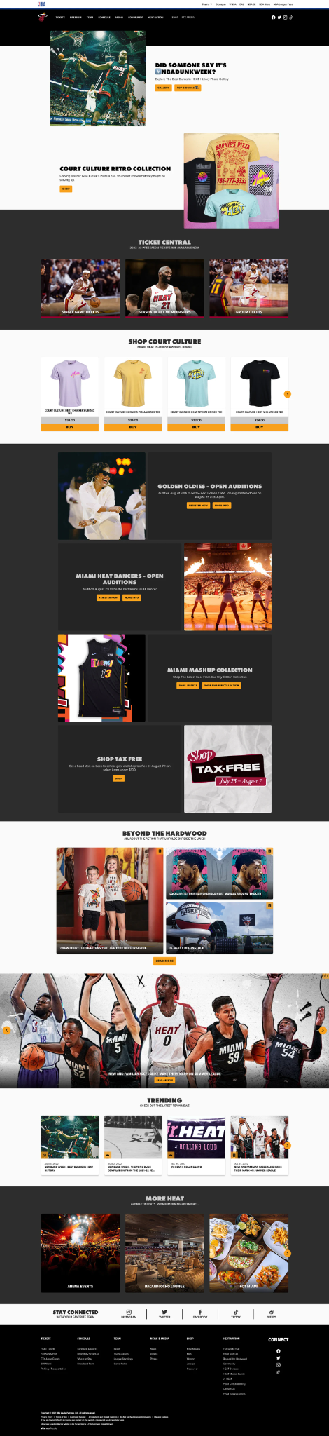
The production homepage shows how the strategy became a flexible system for ticketing, campaigns, merchandise, editorial stories, memberships, and arena content.
Inconsistent templates made the homepage harder to scan and slower to update. High intent actions competed with stories and promotions. During games, even a small content change could become a stressful publishing task.
The real design question was not simply what belongs on the homepage. It was what belongs first right now.
Fans had to work too hard to reach the next game, schedule, or ticket action.
Marketing had limited ways to introduce jerseys and memberships without crowding the hero.
Content teams needed faster patterns for game status, player updates, and postgame changes.
Season scale. Public context, not measured project impact.
These figures describe the scale of the season, not the impact of this project. Public context from the official 2021 to 2022 season review.
Show the current or next game, time, opponent, and most useful action first.
Keep Buy Tickets and View Schedule visible before editorial content asks for attention.
Give scores, recaps, player stories, and team updates a dependable home.
Introduce memberships, jerseys, and HEAT culture after the immediate game need is clear.
This priority model kept the homepage useful through different moments of the season. The content changed, but the decision order stayed understandable.
High visibility storytelling with direct actions.
Ticket options grouped into a clear decision area.
Products introduced without taking over the opening hero.
Auditions, collections, and limited promotions could change independently.
Stories and video kept the homepage connected to the team beyond game results.
Arena events, premium hospitality, food, and social channels extended the journey.
The same game module carries three states. Scroll to move it from pregame to live to final. Neutral data is used throughout: MIA and OPP stand in for real teams, and no historical score is shown.
Game status module schematic, three states, desktop. Neutral team codes and no invented score.
The component structure reduced the need to redesign the page for every state. Editors could update the content and priority while the underlying pattern stayed familiar to fans.
Load game information, artwork, links, and fallback content before tipoff.
Confirm opponent, date, time, ticket destination, broadcast details, and player references.
Move the game module into the primary position and confirm mobile behavior.
Change game status and supporting links without rebuilding the homepage.
Publish the final state, recap, highlights, and related player content.
Move the next game into focus and remove expired live messaging.
Every time sensitive module needs an owner, a source, a publish time, and a fallback state.
Player content changes quickly across a season. The system needed dependable fields and review steps so an old image, outdated roster reference, or incorrect jersey link did not remain on the homepage.
Player card anatomy schematic. The image area marks where approved team photography is placed; no player photography is shown here.
Above the fold schematic, desktop. The game module carries more visual weight than the surrounding story rails.
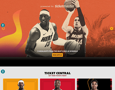
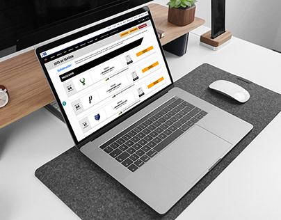
Fans arriving with a clear purpose should not have to search through campaign content. A consistent game module and direct actions help them move from interest to the correct destination with less hesitation.
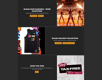
Each of these blocks used the same content, media, action, and timing fields. That is what allowed an audition notice, a City Edition collection, and a tax free weekend promotion to occupy the same slot on different days without a new page build.
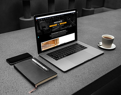
The homepage did not need to explain every program in full. Its job was to establish priority, create interest, and hand visitors to focused destinations such as membership, tickets, and retail.
Commerce appears after the game need is answered. The modules should feel connected to the team story, not inserted as unrelated advertisements.
Consistency did not mean every section looked the same. It meant editors knew where to make changes, what needed review, and how the component would behave across devices.
A broad game and hero canvas with supporting rails.
The game module stays primary and simultaneous content is reduced.
Game information stacks in decision order with a full width primary action.
Responsive layout schematics drawn in code. Frames show structure and priority, not final pixels.
A homepage can feel energetic to fans and still remain practical for the people publishing it.
Games, schedules, and ticket actions gained a dependable place near the top of the experience.
Reusable states and components gave the content team a more practical way to update the homepage during a live season.
Merchandise and memberships could appear in the journey without overwhelming the main game message.
Shared fields and review rules created a clearer process for keeping roster related content current.
Responsive, accessibility, and performance rules helped the same hierarchy remain understandable across screen sizes.
This project reinforced that live sports design is partly a content operations problem. A polished screen matters, but the system behind it determines whether the experience stays accurate when the game changes quickly.
The strongest improvement was designing for change from the beginning. A clear priority model, reusable game states, structured player content, and practical review steps gave the homepage a better chance to stay useful throughout the season.
The final direction gives fans a faster route to what matters now and gives the content team a more flexible way to keep the Miami HEAT story moving.
 Team and league marks are shown for identification only. Miguel Clavel contributed UX and web design, homepage content strategy, CMS component structure, live content operations, and quality assurance.