Skip to case study
All work Miguel Clavel Senior Product Designer
Case study · Medical aesthetics training

From Training Catalog to Clear Membership Journey

I helped turn a wide medical aesthetics training offer into a clearer path from course interest to membership. The work connected landing pages, membership choices, classroom materials, email, and recorded content into one consistent experience.
Role
Web and Visual Designer, UX and Conversion Design
Audience
Licensed medical professionals
Focus
Membership conversion, course discovery, training content
Channels
Web, email, classroom, recorded media
Adobe Photoshop Adobe Illustrator Adobe InDesign PowerPoint Email design Landing page design UX writing Conversion design Content systems Responsive design Stakeholder collaboration Medical content review
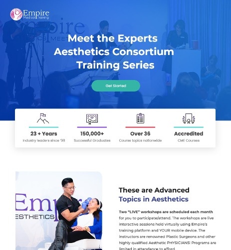
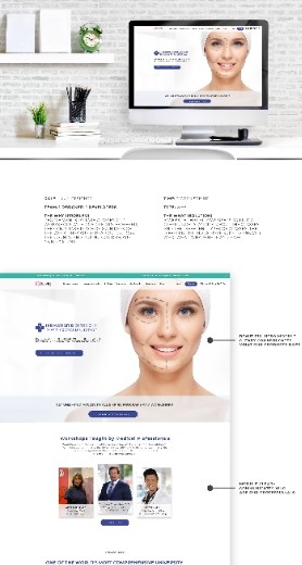
Historical campaign page with the training series headline, an enrollment action, and a strip of company figures Historical website page showing the value proposition and workshop discovery

Historical campaign and website artifacts. Both shown at source size, 463px and 278px wide.

02 · Project snapshot

Four things that shaped the work

The audience

Licensed professionals comparing training topics, formats, schedules, and membership value.

The business need

Increase qualified membership enrollment and make the highest value plan easier to understand.

The content challenge

Turn expert medical material into accurate web, classroom, email, and promotional content.

My contribution

Connect the user journey and visual system across every major touchpoint.

Present day public company context
28+
Years in business
200,000+
Graduates since 1998
700+
Workshops each year
35+
Cities
63+
CME courses across four specialties

These are current public company figures. They describe the scale of the training organization, not the measured outcome of this historical design project.

Sources: Empire Medical Training homepage · Empire Medical Training memberships

04 · Problem

A strong course catalog without a clear decision path

Visitors could see many valuable courses and still leave without answering the questions that decide an enrollment.

  • Which courses fit my professional goals?
  • Which membership gives me the access I need?
  • What is included at each level?
  • Can I attend in person, online, or through recorded learning?
  • What happens after I enroll?

The operational side

The website, email promotions, classroom slides, banners, and recorded content needed to speak the same language. When each channel was designed independently, the experience could feel fragmented and production took longer.

Website Email Classroom slides Banners Recorded content
05 · Audience and trust

Three professionals, three different decisions

Profile 01

Exploring a new service

A licensed professional looking for an introductory course and a low commitment way to begin.

Profile 02

Building confidence

A returning learner comparing several courses, practice support, and continued access.

Profile 03

Expanding a practice

An experienced professional who sees value in broad course access, ongoing education, and premium support.

Trust checklist

Clear eligibility and professional requirements
Accurate course terminology
Transparent inclusions and exclusions
Visible delivery format and schedule
Honest membership comparison
No promises of income or professional outcomes

Eligibility and scope of practice vary by profession and location. Nothing in this program promises employment, income, licensure, business success, or permission to perform procedures.

06 · Funnel diagnosis

Five stages, five design responses

This came from a content and funnel review of the existing pages and campaign material. It was not a formal usability study, and no test or heatmap data was available.

  1. 01

    Discover a course or topic

    Friction: too many individual topics with no grouping.

    Design response

    Grouped course families with plain language names.

  2. 02

    Understand the training format and value

    Friction: format, schedule, and eligibility were hard to compare.

    Design response

    Benefit led summaries with format and date on every card.

  3. 03

    Compare membership options

    Friction: three tiers differed in many small ways at once.

    Design response

    A progressive comparison that starts with fit, then detail.

  4. 04

    Select a plan and enroll

    Friction: trust and terms information sat far from the action.

    Design response

    Eligibility, renewal, and inclusions placed beside enrollment.

  5. 05

    Continue learning through classes and recorded content

    Friction: disconnected materials across channels.

    Design response

    One content system feeding web, email, classroom, and video.

07 · Membership decision model

Choose by fit, not by price alone

The historical creative presented three named plans. The model below rebuilds the decision in neutral terms, since prices and inclusions are only legible inside the artifact.

Historical campaign page showing three Empire membership options side by side, with the Diamond plan marked most popular

Three plans on one screen, with the middle option carrying the emphasis. The comparison had to be readable before any price mattered.

What the historical layout shows

  • Empire Platinum Membership
  • Empire Diamond Membership
  • Empire Dental D Membership
  • Diamond identified as Most Popular in that layout

The product decision underneath it: every plan needed a clear audience, differences a reader could see at a glance, and a confident next step. Prices, course totals, and benefit lists stay inside the artifact until they can be verified from a readable source.

Figures printed inside the screenshot describe the campaign at that time. They are not present day facts and not project results.

Tier 1

Essential

Best for professionals starting with a focused topic.

Price and renewal terms: [ADD VERIFIED DETAIL]
  • One course family
  • Recorded material for the enrolled topic
  • Certificate documentation where applicable
Tier 2

Professional

Best for learners planning several courses and continued development.

Price and renewal terms: [ADD VERIFIED DETAIL]
  • Multiple course families
  • Ongoing access to recorded learning
  • Practice support material
Tier 3Best for broad access

Complete

Best for professionals expanding a practice and needing the broadest access.

Price and renewal terms: [ADD VERIFIED DETAIL]
  • Broadest course access
  • Continued education across topics
  • Premium support

Product principles

  • Every plan remains easy to select
  • Differences are explained in plain language
  • The premium plan earns attention through relevant value, not visual pressure
  • Pricing and renewal terms remain visible
  • Lower priced plans are never hidden or disabled
  • A short fit guide helps users self select

Which plan fits me?

Three questions, one suggestion. Every plan stays visible either way.

Suggested starting point
{{ planName }}
{{ planReason }}

A suggestion only. All three plans remain selectable above.
08 · Landing page

One page that answers the qualifying questions in order

Page hierarchy
  1. 01Clear value proposition for licensed professionals
  2. 02Course categories and learning formats
  3. 03Reasons to trust the training
  4. 04Membership comparison
  5. 05Upcoming opportunities
  6. 06Frequently asked questions
  7. 07Enrollment action

UX decisions

  • Repeated calls to action use consistent language
  • Course cards show level, format, location, and next date
  • Membership appears after the user understands course value
  • Trust details sit near the enrollment decision
  • Mobile preserves the decision order and does not collapse critical terms
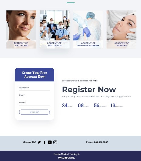
Historical campaign page ending with a registration form beside the enrollment call to action

The close of the page: one form, one action, and the contact details a professional needs before committing.

09 · Annotated walkthrough

The full page, read from top to bottom

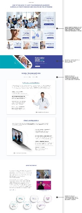
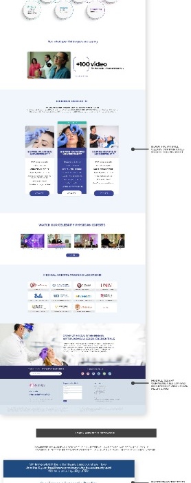
The annotated export is a narrow, very tall document. It stays at source width and the reasoning moves alongside it.

Annotated full page export of the historical training website, marked up section by section

Annotated website export, 278px by 2048px. Opens at source size.

Chapter 01

Homepage value proposition and workshop discovery

The top of the page states who the training is for, then moves straight to upcoming workshops so a qualified visitor can see something real to attend.

Chapter 02

Course and CME content organization

Topics are grouped into families with the calendar close by, so schedule and subject are compared together rather than on separate pages.

Chapter 03

Virtual learning and recorded content

Formats are explained as options rather than fine print: live, virtual, and recorded learning each get their own explanation on the page.

Chapter 04

Membership and conversion paths

Membership appears after course value is established, with the enrollment action repeated in the same language used earlier on the page.

Chapter 05

Campaign reuse and partner credibility

The lower page carries training locations and partner marks, the same trust material the email campaign reused without redesigning it.

09 · Course discovery

A course map instead of a dense table

The groups below are organizational examples. They are not presented as a verified historical catalog.

Injectables and facial aesthetics

Family 01

Skin and laser training

Family 02

Regenerative and wellness topics

Family 03

Practice development and advanced learning

Family 04

Course title placeholder

Eligibility
Licensed professionals, varies by state
Level
Introductory
Format
Live workshop
Location
City placeholder
Date
Next date placeholder
Documentation
Shown only when verified

Course title placeholder

Eligibility
Licensed professionals, varies by state
Level
Intermediate
Format
Online with recorded material
Location
Online
Date
Next date placeholder
Documentation
Shown only when verified
Historical website section showing course and CME organization alongside virtual learning options

Topics, formats, and virtual learning grouped so a reader can find the family first and the individual course second.

10 · Training material system

One content foundation, six outputs

The same approved material carried the classroom, the campaign, and the website. That shared foundation was as much of the work as any single page.

No classroom deck, banner, or recorded lesson export was supplied with this package. The outputs below are named as a system model, not shown as artifacts.

Instructor PowerPoint decks
In class banners
Course handouts
Schedule and topic graphics
Recorded lesson titles and promotional clips
Email and landing page campaigns

The content workflow

  1. 01
    Receive clinical material from the expert
  2. 02
    Identify the learning objective and required terminology
  3. 03
    Build the visual hierarchy
  4. 04
    Review for clinical accuracy
  5. 05
    Adapt for classroom, web, email, and recorded media
  6. 06
    Approve and publish
11 · Expert content to clear communication

Clarity came from structure, not from removing context

Before

Course information placeholder. A dense block of technical course information with inconsistent naming and no clear next action. Terminology varies between the schedule, the deck, and the promotional email. Eligibility appears near the end, and the reader has to infer the format, the location, and what happens after enrollment.

After
  • One clear learning goal
  • Essential eligibility information
  • Scannable course details
  • A visible next step
  • Supporting clinical terms preserved through expert review

Clinical instructions were never rewritten in a way that changed their meaning. Structure and hierarchy did the work.
12 · Recorded content and campaign reuse

One lesson, five deliverables

Historical website section showing membership options followed by conversion paths and partner credibility

The same membership language appears on the website and in the campaign, so a reader who arrives from either recognizes the offer.

Reuse improved consistency and reduced the need to recreate each campaign from zero. This is a qualitative operational outcome until a verified production time metric is added.
  • Short promotional clip
  • Course landing page excerpt
  • Email feature
  • Social banner
  • Classroom reminder slide
13 · Email and promotional system

Campaigns designed inside the same system

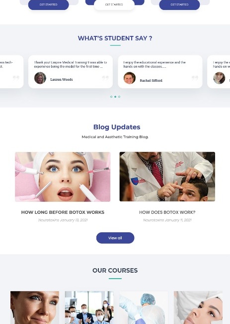
Historical campaign section showing learner testimonials, blog updates, and the four course academies

Proof and breadth in the same scroll: learner comments, then the four academies, so credibility and range are read together.

Email structure

  • Topic and audience are clear immediately
  • Date, location, format, and eligibility are easy to find
  • Instructor or expert information supports trust
  • Membership value appears in context
  • The primary action is consistent with the landing page

Email exports were not supplied with this package, so the structure is described rather than shown.

14 · Collaboration with medical professionals

Clinical review as part of the design workflow

Medical content needs both clarity and accuracy. Direct review with subject matter experts helped preserve terminology, confirm claims, and catch issues before the material reached learners.

  1. 01

    Content intake

    Material and objectives collected from the expert.

  2. 02

    Design translation

    Hierarchy, structure, and visual language applied.

  3. 03

    Clinical review

    Terminology and claims checked by the professional.

  4. 04

    Final approval

    Approved version released to every channel.

Remote collaboration note

Clear annotations, file naming, version notes, and approval states reduced uncertainty when several contributors reviewed the same material.

15 · Responsive and accessible

Designed toward accessible interaction patterns

Desktop, 1440px
Tablet
Mobile, 375px

A responsive behavior model, not a screenshot. The decision order stays the same as the column count drops, and the enrollment action stays full width on small screens.

  • Logical heading order
  • Keyboard accessible controls
  • Visible focus states
  • Sufficient contrast
  • Descriptive labels
  • Tables become readable cards on small screens
  • No critical information behind hover
  • Form errors explained with text
  • Reduced motion support

No formal WCAG certification is claimed.

16 · Measurement plan

What this work should be judged on

Primary outcome
  • Paid membership conversion rate
Decision quality
  • Comparison to checkout click rate
  • Premium tier selection share
  • Plan fit tool completion
  • Pricing and benefits engagement
Learning journey
  • Course detail engagement
  • Registration form completion
  • Returning visitor rate
  • Email click through to course or membership pages
Guardrails
  • Refund and cancellation rate
  • Support questions about plan differences
  • Abandoned checkout rate
  • Accessibility issues

Content operations

  • Time from expert intake to approved asset
  • Number of revision rounds
  • Percentage of content reused across channels
  • Time to update a course or campaign

Awaiting verified data

[ADD VERIFIED MEMBERSHIP CONVERSION CHANGE]
[ADD VERIFIED PREMIUM TIER MIX CHANGE]
[ADD VERIFIED EMAIL OR REGISTRATION CHANGE]
[ADD VERIFIED CONTENT PRODUCTION TIME CHANGE]

Placeholders, not results. Nothing here is presented as a measured outcome.

17 · Impact

One clearer journey across web, email, and the classroom

  • Membership differences became easier to understand
  • The premium tier was positioned through relevant value and user fit
  • Course discovery became more structured and scannable
  • Expert material could be reused across more channels with a consistent message
  • Clinical review became a visible part of the design workflow
  • The website and training materials felt like one connected experience

Qualitative outcomes. Numbers will be added only when verified data is supplied.

18 · Reflection

This project taught me that conversion work in professional education starts with trust. People need to understand what they are choosing, why it fits their goals, and what happens next. The strongest solution was not one page or one campaign. It was a shared content system that connected marketing, membership, and learning.

Clarity can support conversion without pressure
Expert review is part of the user experience
Reusable content systems improve both speed and consistency
Annotated full page export of the historical training website, shown at source size
Web and Visual Designer, UX and Conversion Design Back to top