UX Case Study · Interaction Design · U.S. News Auto Insurance
Turning a 30 question insurance quote into a conversation people finish
Auto insurance quoting asks strangers for their car, their licence, their address, and their phone number before showing a single price. The redesign restructured that intake into five named stages that ask one thing at a time, explain why each question is needed, and let any answer be changed without losing your place. It runs on a deterministic scripted layer, no language model, which was the right call for a regulated financial journey.
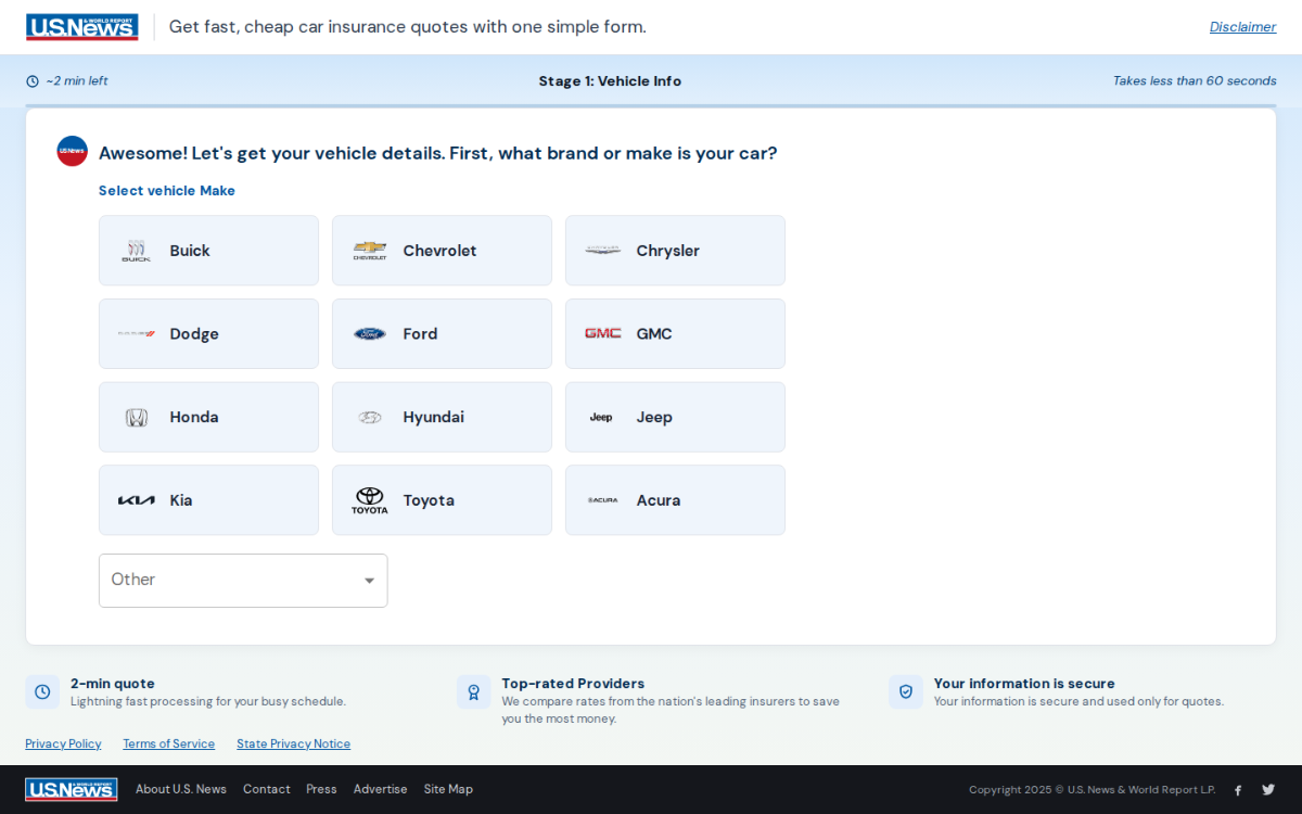
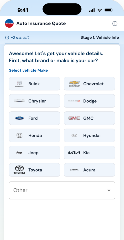
One system, two form factors. Every "AI" moment on these screens is scripted. That is the point.
01 · Overview
The project in 90 seconds
This quote flow works like a guided chat. A U.S. News avatar asks a question, you tap an answer, it lands as an editable chat bubble, and a scripted reply responds. No AI model runs behind it. Along the way, 23 form fields became 19 questions across 5 named stages.
The constraint
A real AI model could not ship in a regulated, high traffic flow. Too slow, too costly, too unpredictable. That limit became the design brief.
The reframe
Keep the feeling of a conversation, drop the machinery. You chat by tapping answers, not by typing free text.
The system
Scripted replies where every line has a job, a smart question order, and logic that trims 23 fields down to 19 questions.
The craft
Kind error messages, live phone formatting, screen reader support, and big touch targets. The details most flows get wrong.
02 · The Wall
The ambition, and the wall
The plan was a true AI intake: you type freely and a model fills in the form behind the scenes. The organization was not ready to ship that in a regulated flow, and for good reasons:
Rigid data requirements
Insurance systems need exact values, not sentences. "A beat up Civic from around 2012" has to become clean data, every single time.
Speed and cost
An AI call for every answer, across huge traffic, on mobile connections. Too slow and too expensive.
Hard to test
You cannot run a clean A/B test when the AI says something different every time.
Users don't want to talk to a machine. They want to feel like the machine is listening.
That sentence split the problem in two. The second half turned out to be designable without a model.
A few terms used on this page
03 · Anatomy
Anatomy of the conversation
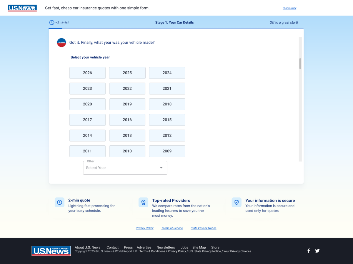
The same shell frames every screen. Only the chat area scrolls, so you never lose your place.
-
Header and disclaimer
Logo, tagline, and a small disclaimer tucked into a tooltip. Compliance without a wall of text.
-
Progress strip
A time chip, the stage name, and a friendly nudge. The countdown really counts down.
-
The hint bar
"Why is this asked?" notes that show up more on sensitive questions, not sprayed everywhere.
-
The chat card
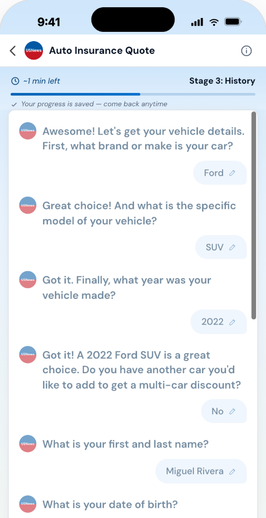
The only part that scrolls. Questions land left, your answers land right as tappable, editable bubbles with a pencil icon.
-
Trust row and legal
"2 min quote · Top rated providers · Your information is secure" stays visible on every screen.
04 · The Flow
The flow, stage by stage
19 questions in 5 named stages. Easy questions come first, personal ones later, and the most valuable asks come last, once you are already invested.
Stage 1 · Vehicle Info
Start with the car, not the person
The first stage is all about the car:
- Make, model, year, and extra vehicles. No personal questions yet.
- Talking about your car is easy, so answers build a streak.
- Logo tiles make the first tap feel like recognition, not form filling.
Stage 2 · Drivers
Get personal, gently
Now the flow asks about you:
- Name, date of birth, gender, and marital status.
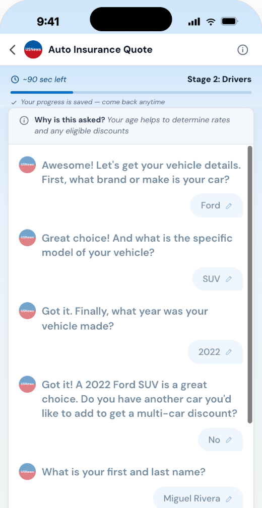
- Every sensitive question explains why it is asked: "Your age helps to determine rates and any eligible discounts."
- "Prefer not to answer" is a full size option, not a footnote. A hidden way out is not a real way out.
Stage 3 · History
Make the scary question safe
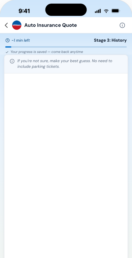
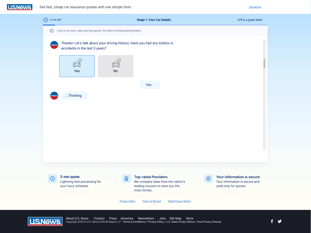
Tickets and accidents is where people quit, so the copy works hardest here:
- "If you're not sure, make your best guess. No need to include parking tickets." It gives permission to be imprecise.
- Answer yes and the reply is "Thanks for the honesty." Honesty gets rewarded, not punished.
- The flow also gets shorter here for people without insurance, the group most likely to leave.
Stage 4 · Perks Profile
Frame the fine print as good news
These are underwriting questions, framed as a benefits check:
- Home, military service, and credit questions all mention "You may be eligible for discounts."
- Each question feels like a chance to save, not a risk check.
Stage 5 · Custom Rates
Give people a real way to say no
The final asks come with a way out:
- The email button says "See my matches," not "Submit." It describes what you get.
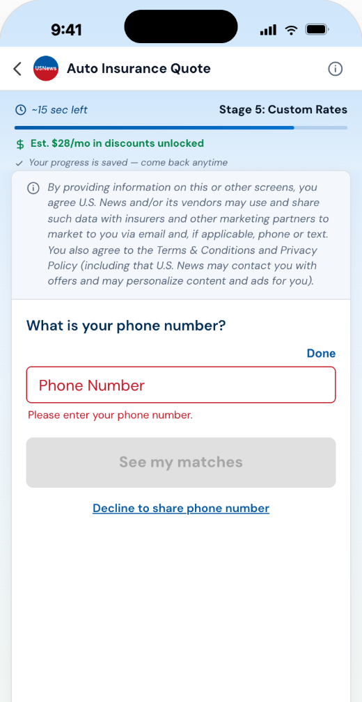
- Phone number is the most valuable field in insurance, and we shipped a visible "Decline to share phone number" link anyway. Forced phone numbers are fake phone numbers.
- The decline path still reaches results, with no penalty.
The full journey on a phone
Most people arrive on a phone. Drag, scroll, or use arrow keys.
Stage 1 · Vehicle make
Stage 2 · DOB with its reason
Stage 3 · The skip fork
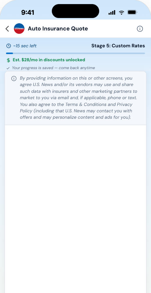
Stage 5 · Consent where it happens
Stage 5 · The decline link
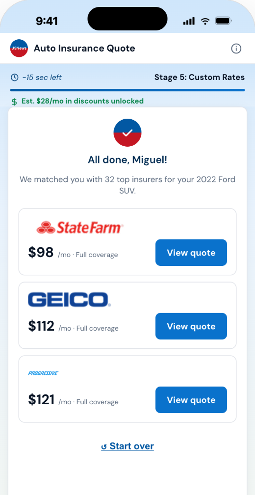
Results (illustrative rates)
05 · Response Layer
The response layer: designed, not improvised
With no model behind it, the flow lives or dies on its scripted replies. Every line has a job, the pacing is planned, and the logic is mapped.
Every "thinking" line does one of four jobs
Memory
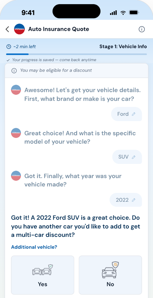
The moment the flow proves it remembers
Question four repeats your car back to you:
- "Got it! A 2022 Ford SUV is a great choice," built live from your last three answers.
- Nothing else in the flow shows memory this clearly.
- Memory is what makes a chat feel like a chat instead of a form with pages.
Pacing
A pause that makes it believable
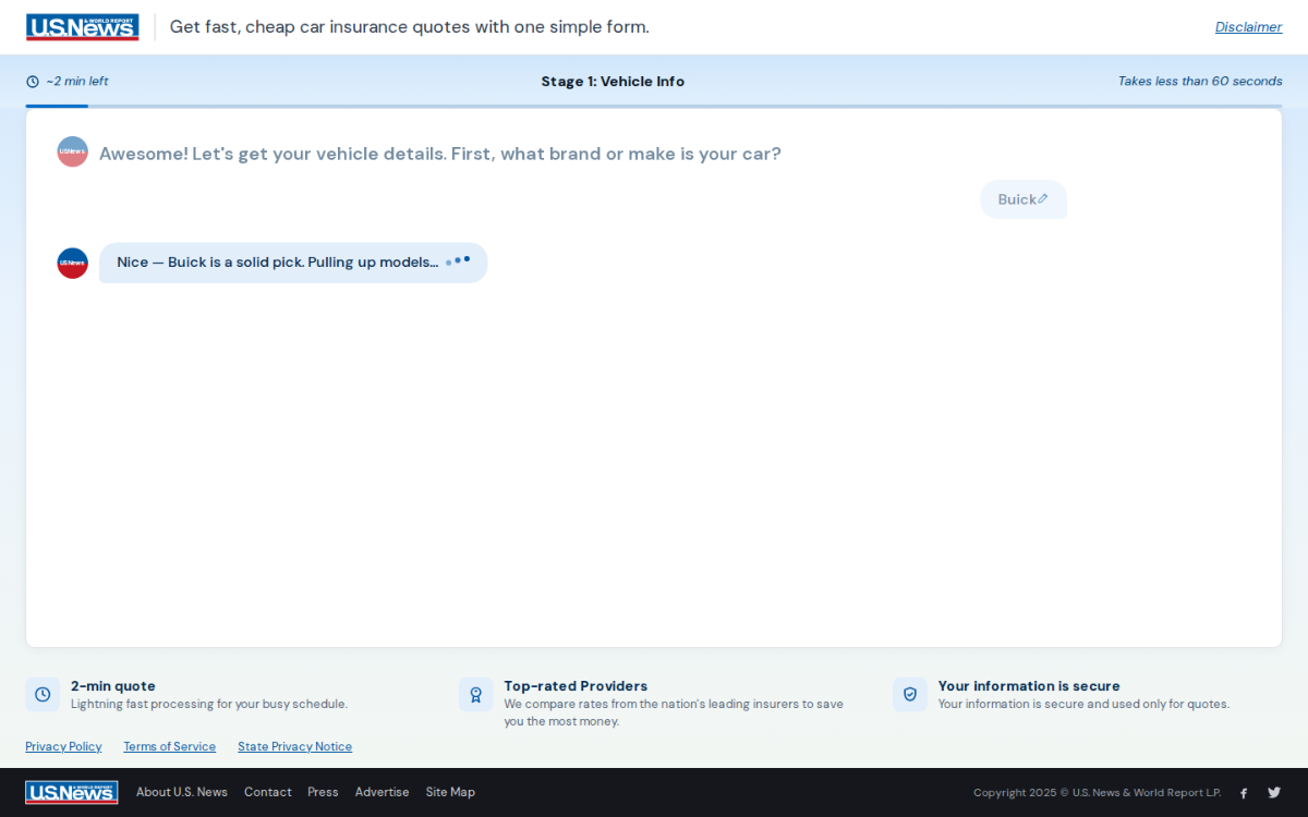
Pick Buick and the reply arrives after 1.3 seconds, with typing dots:
- An instant reply feels like a lookup table. A short pause feels like thought.
- Across 19 questions that adds up to about 25 seconds of waiting, on purpose.
- That is a real cost. The ethics section comes back to it.
The fork where 23 fields become 19 questions
Four fields were removed through logic and consolidation, not because they did not matter. The flow gets shortest for uninsured users, the group most likely to leave.
06 · Craft
The parts easiest to get wrong
Most case studies skip this part. It is where the real work lives.
Validation and errors
Check when you leave, not while you type
Errors appear when you leave a field, never while you are still typing. Flagging half-typed input punishes people for being incomplete.
The button is the backup
The main button stays disabled until everything checks out, so you never tap and get rejected.
Format for people, not the other way
Phone numbers format themselves as (xxx) xxx-xxxx while you type. The format error fixes itself before it can appear.
Specific messages, not "invalid input"
An age under 16 or over 100 gets its own clear message. Every error pairs an icon with words, never color alone.
Accessibility, built in
Announced, not just shown
Errors and stage changes are read aloud by screen readers the moment they appear.
Focus follows the chat
Typed questions focus their input automatically, and never steal focus while you are mid answer.
Sized for thumbs
56px buttons, 118px picture tiles, and nothing smaller than 44px to tap.
A focus ring you can see
A clear 3px ring on every button, link, input, and option card. Not just the browser default.
Reduced motion, respected
Turn off motion in your device settings and every animation calms down: the typing dots, the message fades, the progress fill.
07 · Ethics
Ethics and open questions
Written before the results came in, on purpose. A case study with no self critique is just marketing.
Is a simulated conversation honest?
A scripted chat could mislead more than an honest form. If someone believes they are talking to an AI and they are not, what do we owe them? The shell never claims to be a person or a model, but that is a choice, not a solved problem.
25 seconds of added waiting
1.3 seconds of fake thinking, 19 times. A real cost, taken on purpose, and the field data may prove it too expensive.
Precision traded for completion
Asking body type instead of exact model costs quote accuracy. We traded it for more completed quotes, knowingly.
The scripted military reply
"Thank you for your service" is warm but canned. At scale it can ring hollow. We accepted that risk knowingly rather than missing it.
The ticker's promise
Does "Est. $28/mo in discounts unlocked" promise more than the final quote can deliver?
Where a real model could enter safely, later
- Free text as a shortcut, with the tap flow always there as a fallback.
- AI extraction with a clear confirmation step before anything is saved.
- Smarter question order based on early answers.
None of it ships until it can be measured as cleanly as the flow it would replace.
08 · Measurement
How this will be judged
The experiment is running right now against the existing form. No results are published here, only the plan. People may love a chat style flow, or find it slower when all they want is a price. We are holding both sides honestly.
The test
Chat flow vs the existing form, split by traffic. We track where people arrive from, where they drop off, how far they get, whether they finish, and the quality of the leads that come out.
Reading beyond the average
Results get split by device, traffic source, insured status, and age. The interesting result is rarely the average. Our real hunch is that a chat flow helps some groups and slows down others. The self critique gets rewritten once results are in.
09 · Takeaways
Five reusable ideas
The parts worth reusing, whatever the test says.
A designed response layer
Every scripted line does one of four jobs: acknowledge, explain, show work, or reward. That discipline matters for any system with no model behind it.
Editable answer bubbles
Tap any past answer to change it, then land right back where you were. No back button, no losing your place.
The tail tells you who is talking
Bot bubbles point left, yours point right. Four pixels of corner radius carry the whole sender model before any color is read.
Effort moved, not removed
Total effort is a budget. Easy questions first, personal ones last, and trust signals sized to the moment.
Accessibility as a core constraint
Live announcements, real focus management, and generous touch targets. The section most chat UI case studies cannot write.
The model never shipped. The listening did.
10 · Designing for conversational and AI products
What a regulated conversation taught me about designing for AI
Designing a system that asks questions, holds context, and reacts to answers surfaces the same problems whether a model is driving it or not. Here the implementation was deterministic, every reply scripted, which is what a regulated insurance intake needed. The interaction problems were identical to the ones conversational and agentic products face, and these are the six that mattered most.
One decision at a time
Progressive disclosure over a long form. The user holds one question in their head, not thirty. Agentic products have the same problem in reverse: a system doing many things at once has to surface them one at a time to stay legible.
States you can read
Thinking, asking, confirming, done. The pacing is deliberate because a system that responds instantly reads as a form, and one that stalls silently reads as broken. Either way the user stops trusting it.
Answers stay editable
Any past answer can be changed without losing your place. Correction and recovery are the difference between a system people will use for something that matters and one they abandon halfway.
The user decides what to share
Consent sits at the point of collection, and the phone step has a visible way to decline. Control has to be present in the flow, not buried in a policy page.
Predictable beats clever
A scripted reply that is always right beat a generated one that is usually right. In a regulated financial journey, the boring answer was the correct product decision.
Complexity moved, not hidden
Underwriting still needs the same inputs. The work was sequencing them, explaining why each one is asked, and framing them as a benefits check instead of an interrogation.