Simple to use. Complex to design well.
I led the redesign of U.S. News comparison tables across desktop and mobile. The goal was to help people evaluate complex options with less friction while creating an accessible, reusable system that product, content, SEO, and engineering teams could support across multiple verticals.
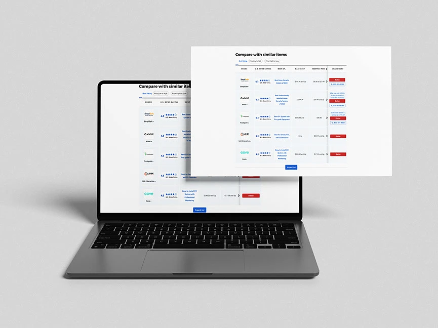
One component family supporting many kinds of decisions
Comparison tables are a high intent part of the U.S. News experience. People arrive with a shortlist, a question, or a decision they need to make. The interface has to make differences visible without asking visitors to decode the table first.
I treated the redesign as a product system rather than a single page. The solution needed to adapt to different data sets and calls to action while keeping the same mental model.
- Surfaces
- Autos, Health, Money, and Reviews
- Core tasks
- Scan, compare, filter, understand, and act
- Responsive challenge
- Dense information across wide and narrow screens
- System need
- Configurable Atlas components and shared implementation rules
The data stayed complex even when the screen became small
The legacy experience asked users to work around the interface. Dense rows slowed scanning. Layout differences changed from one category to another. On mobile, wide tables became difficult to navigate and important context could move off screen.
Behind the interface, one off patterns increased maintenance and made handoff harder. Accessibility and semantic structure could not be treated as a final review. They had to be part of the component model.
Scanability
Too many values competed without enough visual grouping.
Mobile orientation
People could lose track of the product or attribute they were viewing.
Consistency
Different verticals used related patterns without one dependable system.
Accessibility
Focus, keyboard navigation, contrast, and header relationships needed stronger rules.
Discoverability
Comparison content needed clearer semantic structure for search and AI systems.
The product question was: how might we help people compare complex choices with confidence, while creating one flexible system that works across devices, content types, and teams?
Define success before choosing a layout
Four objectives set the direction. Every signal below is something we agreed to watch, not a result we are claiming.
Measurement framework, not claimed numeric results
Help people reach a confident comparison decision
- Task completion during usability testing
- Time to identify a preferred option
- Engagement with meaningful comparison rows
- Visits from the comparison experience to product details
- Action follow through after comparing
Reduce mobile friction
- Abandonment near the comparison module
- Horizontal scroll discovery and completion
- Expansion of collapsed attributes
- Accidental taps and navigation reversals
- Completion of the same comparison task across screen sizes
Create a scalable product system
- Atlas component adoption across verticals
- Visual and interaction differences between implementations
- Design and implementation cycle time
- Clarification requests during handoff
- Reuse of documented variants instead of new one off patterns
Improve quality and discoverability
- Accessibility defects found during QA
- Keyboard and screen reader task completion
- Structured data and semantic markup validation
- Crawlable comparison content and index coverage
- Stability of content relationships across responsive views
The measurement plan connected user behavior, business actions, platform health, and implementation quality. It gave the team a better way to discuss whether the design was working without reducing success to one conversion number.
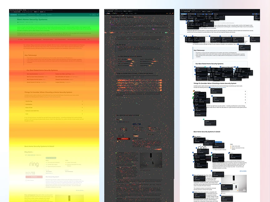
Look for where people lost context, not only where they stopped
Analytics
Reviewed entry points, device mix, table engagement, filter use, action clicks, and abandonment patterns.
Heatmaps and interaction evidence
Looked for ignored rows, repeated scanning, missed controls, scroll behavior, and dense areas.
Usability testing
Observed how participants formed a shortlist, compared attributes, recovered from confusion, and selected a next step.
A/B experiments
Used controlled changes to test hierarchy, labels, row grouping, filters, and action visibility.
Competitive review
Compared patterns from publishers and commerce products to understand common expectations without copying their interfaces.
Research questions
- What information helps someone eliminate an option quickly?
- Which attributes need to remain visible while scrolling?
- When does a user need more detail, and when does detail become clutter?
- Can a mobile visitor maintain orientation without seeing every column at once?
- Which actions belong inside the comparison and which should follow it?
Help me understand the tradeoffs without making me learn the table
When I have several options, help me see the important differences so I can build a shortlist.
Lead with the few attributes that separate products, and group the rest so scanning has a rhythm.
When an attribute matters to me, help me compare that row without losing the product names.
Keep product headers and the active row label in view while the rest of the table moves.
When I am on my phone, help me move through the same information without shrinking everything.
Design a narrow viewport pattern with its own interaction rules instead of scaling the desktop grid.
When I am ready to act, give me a clear next step without turning every cell into a competing advertisement.
One primary action per product, a consistent secondary path to detail, and no competing emphasis in between.
Keep the system understandable when the data changes
-
01
Orientation before density
Always show users what product and attribute they are comparing.
-
02
Progressive detail
Show the most useful information first and let deeper rows expand when needed.
-
03
Consistent actions
Keep labels, placement, and button hierarchy predictable across products.
-
04
One data model, responsive presentations
Desktop and mobile can use different interaction patterns while preserving the same content relationships.
-
05
Accessible by construction
Semantic structure, keyboard behavior, focus, and contrast belong in the component definition.
The mobile design was not a smaller table
- Preserve side by side scanning.
- Keep product and attribute headers available during longer comparisons.
- Group related rows with clear spacing.
- Keep ratings, labels, prices, and actions visually distinct.
- Allow filters and sorting without shifting the whole layout unexpectedly.
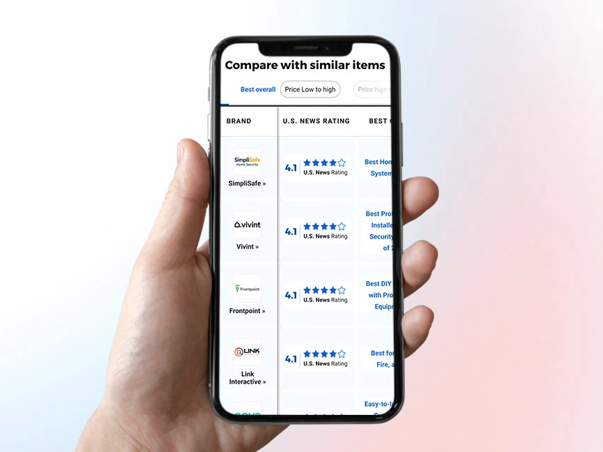
- Use a clear horizontal scroll or swipe affordance when products remain in columns.
- Keep the current product and attribute context visible.
- Collapse secondary rows to reduce a long wall of information.
- Preserve readable type instead of scaling the desktop grid down.
- Keep tap targets large enough and actions separated from scroll gestures.
- Provide an alternate card pattern when the content model makes a wide grid unsuitable.
The goal was not to make desktop and mobile look identical. The goal was to make the decision process feel consistent. Both views used the same data and hierarchy, but each respected the strengths and limits of its screen.
Break one complicated table into dependable parts
Comparison shell
Owns column count, horizontal overflow, sticky regions, and responsive mode.
Product header
Supports logo, name, badge, rating, summary, and primary action.
Attribute group
Creates meaningful sections and optional disclosure.
Attribute row
Connects one label to comparable values and missing data states.
Rating and evidence
Separates editorial rating, supporting label, and accessible text.
Filter and sort controls
Use clear labels, selected states, and announced updates.
Action cell
Maintains consistent hierarchy for details, quote, visit, or purchase actions.
Pagination or comparison limit
Explains how more products enter the experience without overwhelming the view.
Every region uses Atlas tokens for type, color, spacing, border, focus, and responsive behavior.
The quality of the system appears at the edges
Documenting edge cases prevented each vertical from improvising its own answer. It also gave engineers a clear way to test the component before real editorial data exposed the gaps.
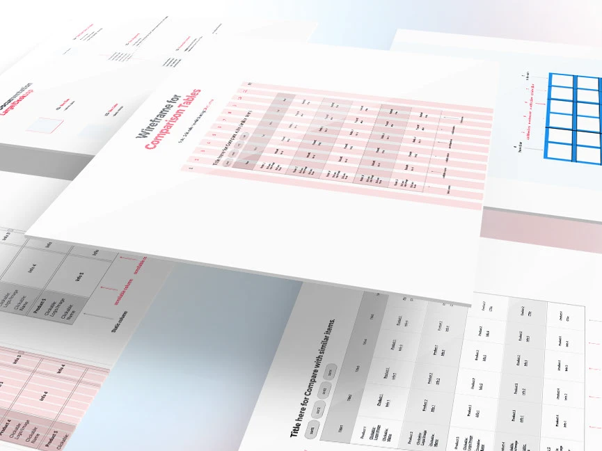
Use prototypes to make tradeoffs visible
- 01
Low fidelity structure
Tested what information belonged in the first scan.
- 02
Responsive patterns
Compared horizontal scrolling, fixed context, cards, and progressive disclosure.
- 03
Interactive prototype
Tested sorting, filtering, expanding, swiping, and action placement in Figma.
- 04
Design system mapping
Connected the chosen patterns to Atlas tokens and reusable components.
- 05
Engineering review
Validated data needs, responsive feasibility, states, and semantic markup before final handoff.
A comparison is only useful when its relationships are understandable
Semantic table structure
Use a descriptive caption, table headers, row and column associations, and appropriate scope values when a true table is present.
Keyboard access
Every sort, filter, disclosure, link, and action must work without a pointer. Focus order must follow the visual and reading order.
Screen reader context
Announce sort state, filter changes, expanded groups, and dynamic result updates without unnecessary repetition.
Visual clarity
Meet WCAG AA contrast, preserve focus visibility, avoid color only meaning, and support text zoom.
Responsive equivalence
Mobile cards or collapsed views must preserve the same names, values, relationships, and actions as desktop.
One source of content
Do not keep a duplicate hidden desktop table only for search or screen readers. Use one dependable source of content and ensure only the active presentation is exposed correctly.
Make the comparison understandable beyond the visual layout
SEO was not a layer added after the interface. The same structure that helps a person understand the comparison also gives search and AI systems clearer relationships to interpret.
- Render important comparison content in crawlable HTML.
- Use semantic table markup when the content is genuinely tabular.
- Keep product names, attributes, ratings, and descriptions connected in the document structure.
- Use descriptive headings, captions, and links.
- Add structured data only when a valid schema matches the visible content.
- Avoid duplicate hidden content across responsive modes.
- Preserve stable URLs and meaningful server rendered content where the platform supports it.
- Validate markup and structured data as part of release QA.
Make the document answer the question before the next time zone wakes up
This project was implemented with developers working overseas. A vague handoff could turn one decision into a full day of waiting. I created a detailed specification that explained what to build, how it should respond, and why each rule existed.
Component anatomy
Named every region, property, dependency, and reusable part.
Responsive behavior matrix
Documented what stays, moves, scrolls, collapses, or changes presentation at each breakpoint.
Interaction states
Covered keyboard, pointer, focus, sorting, filtering, expansion, pagination, and loading.
Data and content contract
Defined required fields, optional fields, missing values, character limits, and content priorities.
Accessibility notes
Specified semantics, labels, announcements, focus order, contrast, and reduced motion behavior.
Edge case library
Showed long names, incomplete data, many products, errors, empty results, and unusual cell content.
Acceptance criteria
Turned design intent into testable statements for implementation and QA.
Decision log
Recorded what was chosen, what was rejected, and the reason so old questions did not reopen.
Annotated prototype
Connected visual examples to the matching state and interaction rule.
QA checklist
Created one shared review list for design, content, SEO, accessibility, and engineering.
The handoff became a shared source of truth. It reduced repeated clarification, made asynchronous review easier, and helped the distributed team protect the design reasoning during implementation.
A clearer comparison experience and a stronger product foundation
- Clearer grouping and hierarchy made dense information easier to scan.
- Mobile became a designed experience with its own interaction rules.
- Atlas integration created more consistent and reusable comparison components.
- Accessibility and semantic structure became part of the design definition.
- The remote handoff reduced ambiguity and gave developers better implementation coverage.
- The system created a stronger foundation for testing conversion assistance, mobile completion, accessibility, and search visibility.
- Compare task completion and time to decision across desktop and mobile.
- Monitor table abandonment, row engagement, filters, sorting, and action follow through.
- Track accessibility defects and keyboard or screen reader task completion.
- Review cross vertical component adoption and implementation differences.
- Validate semantic markup, structured data, crawlability, and index coverage.
These are recommended measurement areas. They are not invented project results.
Responsive design is about preserving understanding, not preserving layout
This project reinforced that a table is not only rows and columns. It is a decision tool, a content model, an accessible relationship, a search surface, and a reusable platform component.
The mobile challenge forced the clearest product thinking. Once the screen could no longer show everything, the team had to decide what creates orientation, what supports confidence, and what can wait.
The detailed handoff mattered for the same reason. Good documentation is part of the product. It helps a distributed team make consistent decisions even when the designer is not in the room.
The best comparison experience makes complexity feel manageable.