The result was more than a visual rebrand. It was a new product model for discovery, measurement, and content operations.
360 covered a broad portfolio of high-intent decisions. People could arrive looking for a mattress, home warranty, VPN, cell phone plan, business service, or another product entirely.
The homepage needed to help a visitor orient quickly without hiding the breadth of the platform. At the same time, product owners needed a way to elevate strategic verticals, content teams needed to make updates, and engineering needed repeatable components rather than one-off layouts.
Legacy reference: usnews.com/360-reviews. Verticals in scope included Home Services, Sleep, Insurance, Home Goods, Digital Privacy, Technology, Business, and Deals.
- Users
- People researching products and services
- Primary task
- Find a relevant recommendation or vertical
- Business role
- Route qualified interest into product experiences
- Content challenge
- Many verticals with different priorities
- Platform challenge
- Responsive modules and CMS flexibility
- Product opportunity
- Turn discovery behavior into a measurable system
The legacy homepage behaved like a catalog. Category cards were repeated in a large grid and most received similar visual weight. This communicated breadth, but it did not help users understand which products were most important, popular, or relevant.
The structure also made the page long and repetitive. Lower verticals depended on users continuing through dense content with limited visual change. Editorial methodology was important, but it competed with the primary product-finding task instead of supporting it.
Flat hierarchy
Categories looked equally important even when user intent and business value differed.
Dense scanning
Repeated grids created visual fatigue and made category names do most of the work.
Weak CTA emphasis
Product actions did not stand out clearly from general navigation.
Uneven discovery
Lower-page verticals received less visibility as attention faded.
Rigid operations
The page was difficult to adapt for campaigns, launches, and changing priorities.
Inconsistent system
Verticals lacked one reusable visual and interaction model.
- 01The hero and first group of content received the strongest attention.
- 02Engagement weakened after the first scroll.
- 03Lower product groups had less opportunity to be seen or selected.
- 04The large grid did not create enough visual rhythm to reset attention.
- 05Priority actions were difficult to separate from general browsing.
How I read the evidence
The heatmap was a starting point, not a complete explanation. I paired the behavioral pattern with analytics, wireframe exploration, and remote usability tasks to understand what users were trying to find and which hierarchies helped them do it.
Evidence to decision
Attention concentrated at the top
Priority products needed earlier visibility
Bring recommended products above the fold
Weak engagement through repeated grids
The page lacked hierarchy and visual rhythm
Alternate module layouts and content density
Lower verticals received less attention
Page order had product consequences
Make section order configurable in the CMS
CTAs blended with general links
The next action was unclear
Use one primary action per featured product
Product North Star
Meaningful product discovery sessions
A homepage visit that leads to a deliberate product action, such as opening a review, exploring a vertical, using homepage search, entering a comparison path, or selecting a high-intent CTA.
Why this metric
Page views alone could not tell us whether the homepage helped anyone. The North Star connected interface behavior to the user task and the business value of moving qualified interest into deeper product experiences.
KPI tree
Discovery
Product-card CTR, vertical engagement, homepage search, and distribution of clicks.
Depth
Section visibility, scroll completion, engagement after the first viewport, and time to first meaningful action.
Conversion assistance
Progression to product detail, comparison, lead, or commerce experiences.
Operational health
CMS update time, module reuse, routine engineering dependency, accessibility issues, and responsive defects.
Measurement framework. Numeric results are not claimed without verified analytics.
Objective 1
Turn the homepage into a product-discovery engine
- Improve meaningful product actions from homepage sessions.
- Improve progression into product detail and comparison experiences.
- Increase engagement with featured Top 3 product modules.
Objective 2
Extend useful engagement below the first viewport
- Improve visibility and engagement for priority verticals.
- Reduce the concentration of all meaningful activity at the top.
- Improve mobile completion of product-finding tasks.
Objective 3
Increase product and content-team velocity
- Reduce the effort required to reorder or launch modules.
- Increase use of approved Material UI patterns.
- Reduce routine engineering work for content configuration.
Objective 4
Create a foundation for future relevance
- Establish stable module and content identifiers.
- Capture privacy-safe interaction signals.
- Define manual fallbacks and guardrails for future personalization.
How we prioritized
Priority decisions balanced four inputs: user demand, business value, evidence of friction, and implementation cost. The redesign did not simply move every important vertical higher. It created a system that could change order as those inputs changed.
I used low-fidelity wireframes to separate structural decisions from visual preference. The team compared product-first and editorial-first openings, visible sections and tabs, repeated grids and alternating layouts, and different relationships between navigation, featured products, and supporting content.
Questions we explored
- Should the homepage lead with a broad brand statement or a product recommendation?
- How many products should represent each vertical?
- Should categories live in tabs, link lists, cards, or a combination?
- Where should lower-priority editorial content appear?
- How could one pattern work for verticals with very different inventories?
- What should change on mobile instead of simply stacking desktop content?
Directions, risks, decisions
Editorial-first
Strong brand storytelling
Delays product discovery
Keep editorial context secondary
Equal product grid
Shows breadth
Recreates flat hierarchy
Replace with prioritized modules
Tabbed groups
Compact
Can hide important verticals
Use only where discovery remains clear
Alternating modules
Creates rhythm and hierarchy
Needs a dependable template
Develop as the core system
Remote sessions on UserTesting.com focused on realistic discovery tasks, not visual preference alone. Participants were asked to find named products, locate a relevant vertical, scan several sections, and explain what they expected to happen after selecting a card or CTA.
Participant counts, task-success rates, and quotes are not reported here because the supplied material does not include the session records.
Reported feedback from the project
- Clear product cards were easier to scan.
- Alternating section layouts made the long page feel more dynamic.
- Large blocks of editorial content felt like clutter when they delayed product choices.
- A featured recommendation helped users understand where to begin.
- Product clarity needed to come before supporting methodology and brand copy.
Decision
Prioritize a Top 3 product pattern in each major vertical. Use one featured recommendation and two supporting options, with category navigation available but visually secondary.
01
Vertical title and short context
Names the vertical and sets expectations in one line, so the module works out of page order.
02
Category or subcategory navigation
Keeps the full catalog reachable while staying visually secondary to the recommendation.
03
One featured product
The strongest image, largest type, and the single primary CTA in the module.
04
Two supporting product cards
Give an alternative without turning the module back into an equal-weight grid.
05
A path to more content
A consistent exit into the vertical for users who want the full set of reviews.
06
Stable analytics ID and CMS ordering rules
Makes each module measurable and movable without changing its event definitions.
The Top 3 pattern balanced recommendation and breadth. It gave users a starting point, gave product owners a clear promotion model, and gave content teams a repeatable configuration instead of a custom layout for every section.
The rebrand modernized typography, spacing, imagery, cards, navigation, and the relationship between U.S. News and the 360 product. Material UI patterns helped create consistent behavior, while the visual hierarchy distinguished featured products from supporting recommendations and category links.
The goal was not decoration. Each visual decision communicated product importance and made the long page easier to parse.
Larger scale for featured products
Size and image area carry the recommendation before any copy is read.
Consistent card anatomy and CTA placement
Category label, title, short description, byline, and action always sit in the same order.
Alternating section backgrounds for rhythm
A background shift marks each new vertical and resets attention on a long page.
Shared spacing and typography across verticals
One scale means a new vertical inherits quality instead of negotiating it.
Module anatomy, drawn as a diagram
Component anatomy drawn in HTML rather than repeating a screenshot used earlier on this page.
The modular system separated the visual template from the content configuration. Product and content teams could reorder verticals, update featured products, rotate supporting cards, add seasonal campaigns, and retire modules without rebuilding the page structure.
Configuration model, one module
- Module ID
- Vertical owner
- Display title
- Featured product
- Two supporting products
- Category links
- Primary CTA
- Image and focal point
- Publish schedule
- Analytics variant
- Manual fallback
The governance tradeoff
Flexibility without guardrails can recreate inconsistency. The handoff therefore needed clear field requirements, character limits, image ratios, empty states, ordering rules, analytics IDs, and responsive acceptance criteria.
Product operations outcome
The reported outcome was a faster, more flexible update model for campaigns and product priorities.
Page length and module sequence


Scroll maps shown at silhouette scale only. They indicate overall page length and module sequence, not readable interface detail.
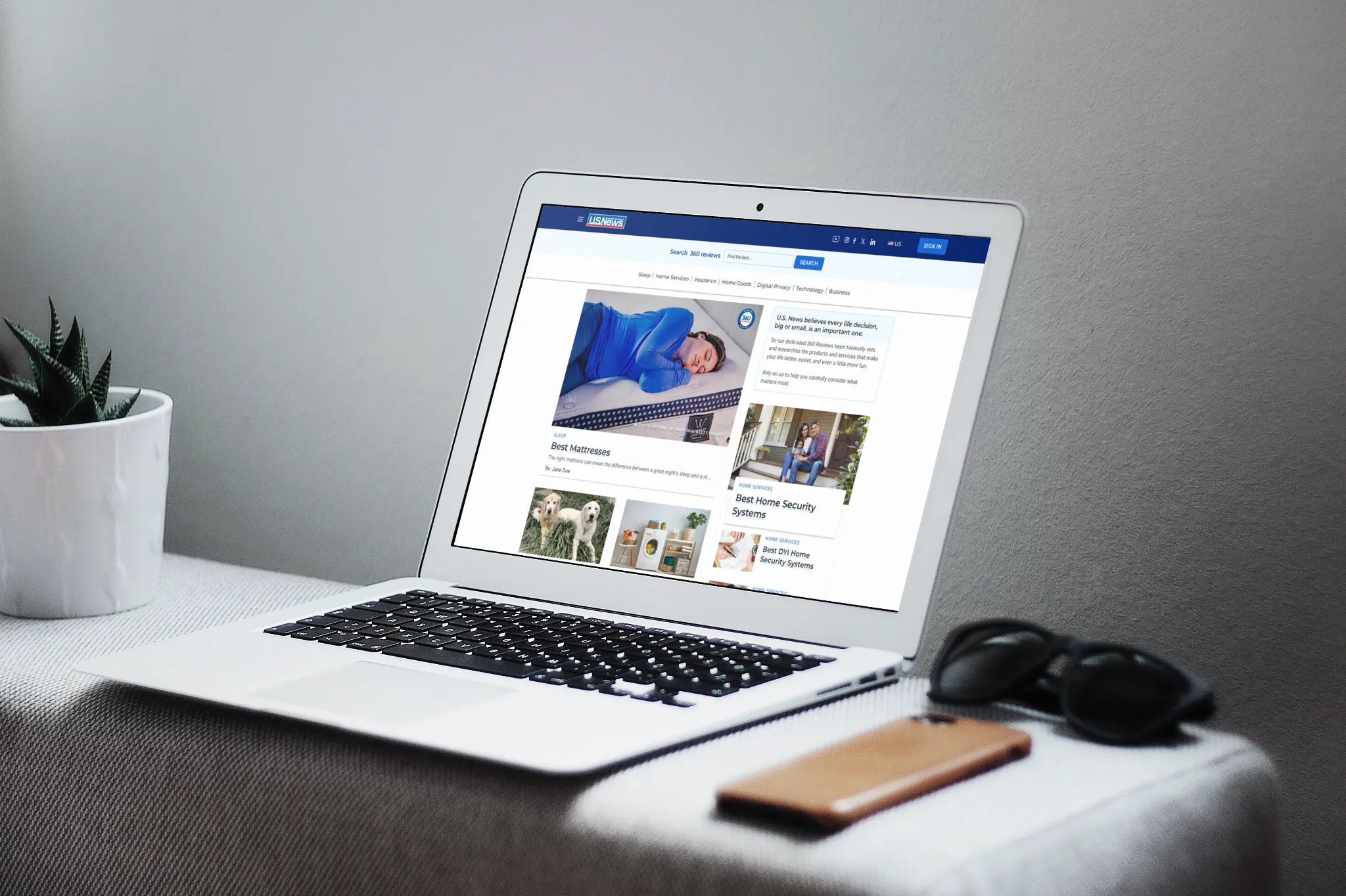
- Clear top-level navigation and homepage search
- Product-led hero area
- Featured recommendation paired with supporting choices
- Category links that remain available without dominating
- Alternating module layouts to restore attention
- Visual separation between product discovery and supporting content
- Collapse global navigation without hiding homepage search.
- Keep the featured product first.
- Stack supporting products in a predictable order.
- Shorten category navigation or place it behind a clearly labeled control.
- Preserve comfortable touch targets.
- Avoid carrying every desktop link into the first mobile viewport.
- Maintain module rhythm with spacing and background shifts.
Desktop and mobile, compared
Side-by-side product relationships
One clear vertical sequence
Wider category navigation
Progressive disclosure where needed
Alternating column composition
Consistent featured-first stacking
Large supporting context
Shorter copy and focused actions
The modular architecture made future personalization possible because each module, product, CTA, and position could have a stable identity. That would allow the team to test different ordering or recommendations later.
Personalization was a future direction, not a shipped claim. Any implementation would require clear user value, privacy review, measurable hypotheses, transparent defaults, and a manual fallback.
Possible future signals, none of them used
Guardrails
- Do not infer sensitive traits.
- Keep core categories discoverable.
- Preserve editorial and product governance.
- Measure incremental value against the default experience.
I documented component anatomy, CMS fields, spacing, responsive transitions, image behavior, content limits, CTA rules, analytics events, and edge cases in Figma. I worked with product owners and engineers to keep implementation aligned with the business strategy instead of reducing the redesign to visual styling.
Component states and variants
CMS content model and validation
Desktop, tablet, and mobile behavior
Accessibility acceptance criteria
Analytics events and stable module IDs
Loading, missing-content, and failure states
The implementation checklist included with this package: Product and engineering handoff.
Reported directional outcomes
- Stronger engagement around featured Top 3 product modules
- Deeper and more balanced attention across the page
- Reduced dependence on a rigid equal-weight grid
- Faster and more flexible CMS updates for campaigns
- More consistent visual and interaction patterns across verticals
- A clearer foundation for future measurement and personalization
System outcomes visible in the work
- Reusable Material UI component patterns
- Configurable vertical modules
- Defined desktop and mobile hierarchy
- Stable places for analytics and experimentation
- Clearer separation of product discovery and supporting editorial content
Exact percentages are intentionally omitted because the supplied material does not include the verified analytics source, date range, or event definitions.
Step 01
Observe
Review module impressions, clicks, scroll distribution, and progression into product experiences.
Step 02
Diagnose
Combine analytics with heatmaps and user tasks to explain weak or unexpected behavior.
Step 03
Experiment
Test module order, featured-product selection, CTA language, and layout variants with defined guardrails.
Step 04
Operationalize
Promote successful patterns into shared components and CMS defaults.
Backlog
- Validate which verticals deserve persistent high placement.
- Compare product-first and editorial-first hero variants.
- Measure featured versus supporting-card engagement.
- Establish mobile-specific baselines.
- Add performance monitoring by module type.
- Pilot personalization only after the default experience is stable.
Heatmaps revealed where attention was disappearing. User testing clarified that people wanted product choices before more editorial content. Wireframes helped the team compare information models before investing in visual design. Material UI created consistency, and the modular CMS strategy gave the homepage room to evolve.
The most important lesson was that a homepage redesign is not only a branding exercise. It is a product decision about what gets seen, what gets measured, who can make changes, and how the system responds when priorities shift.
Behavioral data and user testing answer different questions and are strongest together.
Product hierarchy is a strategic decision, not just a layout choice.
Reusable modules increase both user consistency and organizational speed.
The best redesign creates a learning system after launch.
I helped turn 360's homepage into a clearer discovery experience and a more manageable product platform, giving users a faster path to recommendations and teams a better foundation for continuous improvement.
Miguel Clavel. UX/UI and Product Designer. U.S. News 360 Reviews homepage.